Apple acknowledged the retail staffing changes. “Making these changes was a mistake and the changes are being reversed,” said Kristin Huguet, an Apple spokeswoman. “Our employees are our most important asset and the ones who provide the world-class service our customers deserve.”
The statement is Apple’s response to the staffing cuts at Apple Retail, highlighted by ifoAppleStore. Compare to the statement by Mansfield when Apple commented on the EPEAT mishap:
We’ve recently heard from many loyal Apple customers who were disappointed to learn that we had removed our products from the EPEAT rating system. I recognize that this was a mistake. Starting today, all eligible Apple products are back on EPEAT.
One seems like a genuine apology. One feels very fake.
You don’t accidentally lay people off. This was clearly a departmental policy.
For a company that reported $8.8 billion dollars in profit last quarter, the goals of Browett should not be shaving pennies off the bottom line. The whole point of their retail stores is to be of assistance — cutting staff does not achieve that. The company is on the eve of iPhone 5 and iPad mini launches; it seems logical they should be hiring additional staff, not “learning to run leaner”.
Retail is a key instrument in introducing new customers to Apple. Yet, it feels like if, it hadn’t been for the public feet stamping, this policy would have continued. That scares me.
Our license to include the YouTube app in iOS has ended, customers can use YouTube in the Safari browser and Google is working on a new YouTube app to be on the App Store.
It is unknown whether this is due to Apple’s continued ‘Google hate’, or if Google decided they wanted to monetize iOS users and refused to renew the license.
Regardless of the reasoning for the removal, the outcome is definitely anti-consumer: Google’s track record with native iOS apps isn’t good.
Plus, it’ll be rammed to the brim with adverts and have a gazillion links to Google+ scattered throughout.
The next-generation broadband roll out being administered by Broadband Delivery UK uses £530m of public money in the commercial sector, so it needs clearance from the European Commission - that approval already faces delays over competition concerns.
Now, it’s been revealed the majority of regional projects face further delay because officials in Brussels say they have yet to receive the relevant paperwork from the UK.
The API challenges are the most commonly shared concern. Comi says, one problem is that the iCloud API is too low level, meaning that it takes a lot of code to accomplish basic tasks. For example, the iCloud API doesn’t offer a single function for putting a file into iCloud, or removing one.
In contrast to many Apple frameworks, the iCloud stack is very weird, and almost feels “tacked on”. The basic idea for a developer, is that by moving document files to a special location, they are ‘moved into iCloud’. Although it is easy to visualise this process, it is cumbersome to implement. If a user turns iCloud off, for example, the onus is on the developer to move all the files back into the local application storage, ensuring to handle edge cases appropriately (such as disabling iCloud on one device, but not others). Later, if the user re-enables iCloud, the developer has even more work to do, matching and merging documents in the cloud with those that, until a moment ago, lived in the confines of the local device only. Another layer of complexity arises when the document model needs to change (by an app update): What happens if the user has two devices, but has only updated one of them?
Alongside the blips in Apple’s backend (which developers have no means to debug) these incompatibilities mean that integrating iCloud is frustrating and painful; it is much more work than it should be. Low-level APIs are important, for applications that require deeper customisation and behaviour, but the lack of a simple API has deterred almost everybody. Even complex apps would benefit from a higher-level “save to iCloud” command sometimes, as you don’t always need specialised behaviour to perform some actions.
The fear I have is that iCloud may follow the path of Apple’s other cloud initiatives; it fails and Apple rebrands it in a couple of years. This pattern has been shown throughout the past: iTools to .Mac, .Mac to MobileMe, MobileMe to iCloud. However, the improvements made in iOS 6 and their repeated statements on their commitment to iCloud give me confidence that these issues will be resolved. Consequently, iCloud will work as it should: like magic.
In some places, it does act like magic. Photo Stream is simply great. Logging in to a new iOS device and seeing all the bookmarks from your Mac is fantastic. It is a shame other areas, particularly those involving third-party apps, let the service down.
Unlike iOS, I never ran a beta of Mountain Lion. My first experience with the new OS was yesterday, when it was released. About an hour of Error 100 frustration later, installation began.
Installation is App-Store only, which is 80% great, 20% annoyance … particularly when your internet isn’t very good. If your internet isn’t fast enough to download at least 10% in a couple of minutes, it seems like the process has failed, as the progress bar doesn’t move a single pixel until about 10% of the total 4GB has transferred. Once the download step had finished, however, installation was streamlined and flawless. Click, agree to terms and conditions, and wait. Even in 2012, computers still fail at approximating time remaining. My progress status fluctuated from 30 to 10 minutes, to an hour, over the course of the install. In reality, it took about 40 minutes to install.
The Mac proceeded to reboot into Mountain Lion. Immediately, the App Store prompted to me to download even more updates. The first indicator that this was a new OS was that I found the issue I described above has been fixed in Mountain Lion. Launchpad will give you fine-grained download progress if you hover over the Dock icon.
These first patches also highlighted the death of Software Update, which is now amalgamated into the App Store Updates tab. Theoretically, this makes a lot of sense: all your updates in one place. In their implementation, though, Apple haven’t quite hit the spot. Software Update isn’t really integrated into the App Store; it just kinda sits next to your app updates. For instance, iPhoto updates are segregated into a different section than Pixelmator or ScreenFlow. “Update All” applies to everything, so in practice it doesn’t really make a practical difference, but it still agitates. A layer of unnecessary complexity. Better than Lion, but not perfect.
What did I notice next? The glass Dock. If you have been clinging to open application indicator lights in Lion, then get ready to change. The lights in Mountain Lion are so small, really thin blue strips, you have to literally squint to see them. If you are switching apps using the Dock, you literally won’t see these lights, even in peripheral vision. Regarding the main Dock aesthetic change, from a gloss varnish to frosted solid glass, I like it. Whilst it is reflective, it isn’t translucent like the old Dock’s. I just think it looks better, and this is from someone who likes the transparent menubar.
Safari 6 is fantastic. I don’t know how to describe it. It is just better. There is definitely a different scrolling architecture. It’s snappier. Webpages flow. You can tell the GPU is involved. I can’t test whether JavaScript performance is better, as the Sunspider test refuses to complete, but it feels better. Facebook’s homepage is near-instantaneous to render. Talking of social sites, I love the tweeting in Safari just as much as I do in iOS. It is so convenient, and the UI is really pretty to boot. With a lot of tabs open, “Tab View” is surprisingly useful, too. I thought it was just some visual sugar, which it kinda is, but I have used it for utility a couple of times already.
Safari’s Reader hasn’t changed in functionality, but it is presented differently in the UI. When applicable, it highlights to a very piercing blue. One one side, the obviousness is distracting. My eye flits to the button almost every page load it turns blue. I’ve found, though, I have actually used the feature because of it — the distraction reminds me to click it.
The UI for Safari’s progress bar has completely changed. I’m still undecided whether it was for the better. Rather than stepping through different percentiles of progress, the Mountain Lion progress bar has a propensity to keep moving. Whether it is being more granular in displaying completion progress or whether it is purely an optical illusion, I don’t know. Up to this point, everything is fine. It gets obnoxious a few milliseconds later, when Safari decides to tell you the page has finished loading (even if it actually hasn’t), and the loading bar literally zooms off to the right[4]. The rapid increase in acceleration of the animation is what puts you off. I’d assume that over a longer period of time my brain will get used to the lightning-flash-toolbar, but for now I despise it. It isn’t enough of an agitation to overcome my otherwise universal love of the browser.
The most striking change to Safari has to be the omnibox[5]. It has integrated so well into the workflow I nearly forgot to write about it. If you want to know what it is like, open any browser that has existed since about 2006. Personally, I think it should prioritise history results over search suggestions but the mere fact it exists at all is a god send, honestly. There was a reason every other browser had moved to this UI paradigm: because it’s good.
In regard to Documents in the Cloud, I have turned it off. It isn’t for me. It isn’t really meant for me. A good test to see if you will like this new feature is to ask yourself if you could live with only one subdirectory to organise files?
If you said yes, iCloud Documents are going to be a great fit. It is obviously for people who find the Finder confusing; people who are relieved with the thought that they don’t have to click Finder. My mum, for instance, loves this new metaphor (“You mean, I don’t have to worry about where the files are?”). For people who use it, they have the added benefits of syncing, backup and simplicity. For people that don’t, you have the traditional benefits of an actual filesystem. It’s almost like Apple is telling “geeks” to stick to Dropbox.
In my opinion, the other main tentpole change is Notification Center. Growl fans will crow that this is a rip-off of it, but it really isn’t. Sure, you get toast notifications in the top-right hand corner but what sets it apart is the slide-out section. Growl never had anything like it. You can just let notifications fly off and review them at your leisure in the Center.
There is a profound importance to the fact it is first-party. Although Growl was relatively pervasive in Mac apps, I feel that Notification Center use is quickly going to explode. Something which Growl never had was first-party integration. As you might expect, Apple’s apps exploit Notification Center as much as people, even for software updates. Brilliant.
Coming from iOS, you will be right at home with Notification Center. The linen even makes sense on Mountain Lion, as the slide-out panel does sit conceptually at “layer zero”. I only really have one niggle with it; it forces upon you a menubar item that cannot be moved. It has to sit in the top-right corner. Why is this annoying? My brain is ingrained to think that the top-right of the screen is Spotlight. I’ve lost count of how many times I’ve gone to do a search by clicking the top-right corner of the screen, out of habit, and then getting brutally reminded that it is no longer Spotlight. Even if Apple doesn’t want to let people remove the icon completely, they should let you at least move it to a different position in the menubar lineup.
I said that Notification Center is the last major feature that I can recall, but that isn’t really true. There is an underlying feeling, throughout Mountain Lion, of polish and finesse. It feels finished. It feels stable, something Lion certainly didn’t at regular intervals. Things that are confused ideas in Lion are refined into really great features in Mountain Lion. Bouncy scrolling is everywhere and feels great to the touch. When you approach the scroll-bar, if you want to drag with the cursor, the skinny bar widens to accommodate easier scrolling. Due to push notification support, the App Store actually feels like a part of the OS, rather than a disparate app. “All My Files” doesn’t lag anymore. Reminders and Notes round of the synchronicity with iOS beautifully. The inclusion of Game Center cements the fact that your iPhone and Mac are actually part of the same company. You can finally search for apps inside Launchpad making it semi-usable. Heck, Time Machine can backup to multiple volumes. It isn’t one feature in particular, it can only really be described as system-wide refinements that finish everything Lion started and make them make sense.
On the latest Talk Show, Gruber wondered what the spread of Twitter clients really is. It made me realise that no one has really explored how many people use Twitter’s own apps. I thought I’d (try to) find out.
Firstly, Twitter doesn’t report the information itself, so the only way to find out is by brute force. Due to the Twitter Streaming APIs, this is relatively straightforward. I ran a script which literally scanned tweets for their source link and counted each unique source.
Due to the time sensitivity of Twitter, finding one exact data set is impossible as client usage varies constantly. For instance, a big global event may encourage people to tweet on a day they otherwise wouldn’t. On a normal day, though, this method should be a good indicator of average user behaviour and app usage. For reference, the results that I collected are from a random sampling of tweets across a 9-hour period, approximately 9am to 5.30pm on the 18th July.
In total, I collected and analysed one million tweets. Whilst this seems like a lot, it still pales in comparison to daily tweet volume. As always, I would have loved to collect more data, but there are, naturally, physical limitations to doing so. However, I still feel the study was significant enough to portray the trends to a good degree of accuracy and warrants publishing.
Below is a sorted list of the findings. Any app that created more than 0.02% of tweets, in the period observed, is listed.
Source
Count
Client?
Web
243431
Yes
Twitter for iPhone
152116
Yes
Twitter for Android
116765
Yes
Twitter for Blackberry
115244
Yes
UberSocial for Blackberry
34502
Yes
Mobile Web
28563
Yes
TweetDeck
19627
Yes
Echofon
18718
Yes
Keitai Web
14381
Yes
twicca
12901
Yes
TweetCaster for Android
11746
Yes
Write Longer
11172
No
twitterfeed
11020
No
Facebook
10488
No
Twitter for iPad
9603
Yes
twittbot.net
8712
No
Tweet Button
8639
No
Janetter
7593
Yes
twipple
7515
Yes
Tweetbot for iOS
6845
Yes
Instagram
5917
No
Plume for Android
5621
Yes
SOICHA
5259
Yes
txt
5180
Yes
HootSuite
4560
Yes
UberSocial for Android
4543
Yes
Tumblr
3938
No
Tween
3909
Yes
dlvr.it
3327
No
ついっぷる for iPhone
3194
Yes
Google
3117
No
Twitter for Mac
2446
Yes
Twipple for Android
2438
Yes
jigtwi
2261
Yes
Twittascope
2201
Yes
Ask.fm
1940
No
m.tweete.net
1866
Yes
TweetList
1831
Yes
foursquare
1825
No
Saezuri
1743
Yes
Tweetlogix
1649
Yes
YoruFukurou
1410
Yes
movatwi.jp
1322
Yes
ツイタマ
1263
Yes
Samsung Mobile
1262
No
Seesmic
1134
Yes
TweetCaster for iOS
1113
Yes
ついっぷる for iPhone
1100
Yes
Tweet Old Post
1097
No
yubitter
1052
Yes
ShootingStar
983
Yes
UberSocial Mobile
948
Yes
Tuitwit
938
Yes
jigtwi for Android
882
Yes
OpenTween
815
Yes
A.plus for Blackberry
779
Yes
Twipple for Android
764
Yes
SocialScope
759
Yes
Twitter for Windows Phone
745
Yes
IFTTT
720
No
Twiterous
707
Yes
Twidroyd for Android
688
Yes
EasyBotter
650
No
Tweet ATOK
639
Yes
Social by Nokia
612
Yes
TwitBird
609
Yes
ついっぷる Pro for iPhone
553
Yes
Addictweet
511
Yes
Krile2
500
No
Photos on iOS
493
No
UberSocial for iPhone
489
Yes
twitcle
462
Yes
twtkr
459
Yes
CitCuit
442
Yes
UbеrSociаl for BlackBerry
439
Yes
MetroTwit
438
Yes
vk.com
435
No
Dabr
429
Yes
Ustream.TV
420
No
ニコニコ動画
413
No
Pinterest
404
No
TweetList Pro
398
Yes
BotMaker
395
No
Twil2
394
No
SocialOomph
388
No
TwitCasting
384
No
TwitPal
377
Yes
buysellyourtweets
377
No
UberSocial
368
Yes
PlayStation®Vita
357
Yes
TwitMania
357
Yes
Silver Bird
357
Yes
Osfoora for iPhone
354
Yes
Teewee
321
Yes
STATUSEM
321
No
Tower Heist Takeover, BlackBerry
317
Yes
Twittelator
316
Yes
mixi ボイス
309
Yes
Buffer
309
No
Twipple Pro for Android
302
Yes
ツイ助
299
No
Nimbuzz Mobile
298
No
Ultwimate Mobile
285
Yes
HTC Peep
274
Yes
モバツイ touch
273
Yes
LinkedIn
261
No
Twitscoop
253
Yes
vk.com pages
249
No
Camera on iOS
248
No
weheartit.com
242
No
Paper.li
237
No
Twitter for iAppli
232
Yes
Hotot for Chrome
232
Yes
TwitIQ
231
Yes
Azurea for Windows
212
Yes
モバツイsmart / www.movatwi.jp
210
Yes
Follow to Follow
206
No
Twittanic
203
Yes
The raw data, by itself, is useless. In order to determine how many people would be affected by a ban on third-party clients, the first step is to identify anyone using native clients. There are a handful of them: Twitter.com, m.twitter.com, Twitter for iPhone, Android, Blackberry, Windows Phone, iPad, Mac as well as TweetDeck and Keitai Web (Twitter’s Japanese client) and SMS (identified as “txt”). Twitter recently announced a client for Nokia S40, but I don’t think it has caught on — zero of the million tweets originated from this client.
The total of these rows is 708,101 out of 1,000,000.
Therefore, this means that at least 70.8% of the total originated from first-party clients, and at most 29.2% of people use third-party Twitter clients.
Already, first-party apps clearly have a monopoly. The actual share of first-party usage is even higher, however.
This is because not all of the observed apps are actually “clients”. Many are simply apps which post to Twitter. Instagram is an example of this; it just posts links back to its own service. The “Tweet Button” is a first-party example: it allows the user to tweet, but it isn’t a client. Therefore, it is necessary to filter out these “non-clients” to show a true representation of first-party-client dominance.
In an ideal scenario, a human would individually assess the ‘clientness’ of each app that created a tweet in the period. However, this is too time-consuming to be feasible. Instead, I have hand-checked only the 118 apps listed above, and use that ratio to extrapolate across the 291,899 remaining tweets to gain a relatively-accurate estimate.
My assessment of each app is denoted in the third column of the table. I found that 36 of those apps were not clients (identified by the third column). Applying that ratio (30.5%) to the 291,899 tweets, it is estimated that 89,053 tweets were not from clients. By discounting these ‘invalid’ tweets, the overall bucket is reduced, thereby increasing the final proportion of first-party app usage to 708,101 out of 910,947 tweets, equivalent to a percentage share of over 77%.
For people that think Twitter will never ban third-party clients because there would be too much backlash, I think this 77% figure shows that Twitter could do it with ease. A large portion of the 23% would be happily herded to a first-party client, as they don’t really care what app they use — it just turned out that the client they first downloaded wasn’t a Twitter-owned app. The only people who would care would be the geeks, like me and anyone else who could be bothered to read this post, who actually care about the client they are using. And let’s face it, Twitter doesn’t care about geeks.
“The ‘Gas’ mechanic provides a reprieve for a natural break. At that point you can either pay for Gas or leave the game to recharge. The short-sharp play sessions mean that you’re happy to come back and have another go. This design fits with the play patterns of people on the move. That’s really what drove the design.”
I think that is dishonest. The Gas mechanism is clearly imposed for monetization. It isn’t because it “fits with the play patterns of people on the move”. If that was the case, there would be no reason for players to buy Gas and the app would make no money. However, the developer knows people play more than 30 seconds of a game at a time, so they found a way to exploit impatience for revenue.
Like I said, I think the quote above is untruthful. However, many people have criticised the developer simply for using In-App Purchases in this way and I don’t think thats fair either. Nobody is forced to play the game; nobody is forced to buy the Gas. They just choose to do so. CSR Racing isn’t the number one top-grossing app because it is unscrupulously tricking users to buy stuff. Pure and simple, it turns out people are willing to pay to circumvent time restrictions.
You can’t criticise a developer for building something people want to use and pay for, even if you yourself think it is a waste of money.
Google is having to resort to using URL schemes to allow third-parties to detect whether Chrome is installed on a user’s iOS device. This is such a hack-job it is ridiculous. App developers should not have to perform string manipulation to open in a particular browser.
This should be an OS-wide setting, such that — to a developer — the API is transparent and abstracted. Any call to [[UIApplication sharedApplication] openURL:URL] would automatically trigger the user’s chosen browser.
It should not require app developers to hard-code support for every browser, as it does today.
This tablet seems to have 3G model, but not all current carrier might sale, somea career name are not seen in list of resellers.
This source, who seems to look a prototype, told that new tablet (iPad mini?) had same hight with Nexus 7 and slight larger width. Even though front projection size is larger than rivals, thickness of that new tablet is considered to be thinner than current most thinnest tablet Kindle Fire, and to be similar with iPod touch (4th generation) by this source.
The momentum behind these rumours is so high right now, it has become an near-inevitability, especially as the rumour has been backed up by the Wall Street Journal and Bloomberg.
Pricing for the device is assumed to be $199, to compete directly with the Fire and the Nexus 7. However, this introduces a complication in Apple’s product lineup: the iPod touch. The iPod touch is, also, $199. Clearly, Apple can’t have both of these products at the same price. How much cheaper can they price the iPod touch? Even at $159, a 3.5inch iPod touch seems really expensive standing next to a 7.8inch iPad mini.
Reaching the sub-$150’s, though, you hit another price wall. The iPod nano sells for $129. Assumedly, they’d have to make the Nano cheaper as well.
$70 is the difference between an iPod nano and an iPod touch. On that basis, I’d expect a similar gap between the Touch and the iPad Mini. So how about a $199 Mini and a $149 iPod? The Nano then can go to $109. I suppose that’s a possibility.
But, just looking back at that paragraph, it doesn’t feel right to me. In fact, it makes me believe even more strongly that the Mini is not going to be $199. I think $249 makes much more sense. The $200-$300 price range is a market segment where the iOS ecosystem is currently absent; a $249 iPad Mini would be a great fit. Also, I think $249 is still cheap enough to suck the air out of the 7inch tablet competition. In the long run, the Mini could fall to $199, if necessary.
At launch though, I think $199 is overly price-aggressive and has too many implications on the rest of Apple’s lineup, to be feasible.
Holding back in mobile payments was a deliberate strategy, the result of deep discussion last year. Some Apple engineers argued for a more-aggressive approach that would integrate payments more directly.
But Apple executives chose the go-slow approach for now. An Apple spokeswoman declined to comment on the decision-making process. Apple’s head of world-wide marketing, Phil Schiller, in an interview last month, said that digital-wallet mobile-payment services are “all fighting over their piece of the pie, and we aren’t doing that.”
On the basis of this article, I reckon that the next iPhone will have NFC but it won’t have support for mobile payments. It’ll be used for a more elegant execution of Passbook, for instance, but the iPhone 5 won’t become your wallet.
Next year, or whenever, Apple decides to enter the mobile payment market properly, Apple can then push a software update containing the functionality, which the iPhone 5 will be in a perfect position to use, as it already has the NFC chip inside. This means that when Apple enters the merchant space, they will already have a large base of customers who can exploit their take on the “mobile wallet”.
Its hardware and software smoothness rival Apple’s, and its luxury humiliates the Kindle Fire. In short, it’s possible that this tablet may finally help solve Google’s chicken-and-egg problem. Maybe once it becomes popular, people will finally start writing decent apps for it …
I’m not confident that will happen.
The 7inch size means that scaled phone apps look ‘okay’ on the device. Developers never saw a need to customise their apps for the 10inch screen size, where the issue is even more prominent, so are they really going to start making custom apps for a device where their apps actually are bearable?
Case in point: the Kindle Fire. There are apps in the Fire’s app marketplace, but the vast majority are phone apps. Despite that device’s success, developers haven’t been encouraged to make premier tablet experiences for that.
Where the copyright holder makes available to his customer a copy — tangible or intangible — and at the same time concludes, in return form payment of a fee, a licence agreement granting the customer the right to use that copy for an unlimited period, that rightholder sells the copy to the customer and thus exhausts his exclusive distribution right. Such a transaction involves a transfer of the right of ownership of the copy. Therefore, even if the licence agreement prohibits a further transfer, the rightholder can no longer oppose the resale of that copy.
The ramifications of this are quite incredible. Notably game companies, who have shifted to digital distribution to shut down the aftermarket sales, are undermined.
I’m not quite sure how DRM factors into this, but seemingly this ruling overrides any attempt by software publishers to prevent resale. This includes the App Store; this judgement gives people the right to sell their iOS apps on to other people.
The level of compliance necessary by software publishers seems undefined, at the current stage. For example, do Steam or Apple have to implement features in their stores to allow resale? Or is it implicit - people are allowed to resell digital goods if they can crack the DRM and associated policies surrounding it?
This is a very interesting decision, with wide-reaching implications. Therefore, there are probably a million companies ready to oppose it. Bring on the appeals …
The study surveyed more than 30,000 U.S. mobile subscribers and found Samsung to be the top handset manufacturer overall with 25.7 percent market share. Google Android continued to grow its share in the U.S. smartphone market, accounting for 50.9 percent of smartphone subscribers, while Apple captured 31.9 percent.
According to ComScore, iPhone has outgrown Android in the smartphone market, in the last three months, 1.7% to 0.8% growth. It should be emphasised that this is no indication of the death of Android, or anything like that. At some point, Android had to reach a level of saturation. After all, Android and iPhone already take up over 80% of the space. In effect, there is only about 17% left to fight over.
In the wider scheme of the market, the story remains the same as before; iOS and Android grow whilst everyone else falters and collapses, namely BBOS and Symbian. Windows Phone remained at about the same level as the previous quarter, which I suppose is slightly encouraging.
Most importantly, this data continues to counter the endless bearish analysts who predict the imminent death of the iPhone. This data reinforces the need for carriers to have the iPhone in their arsenal. There is a reason Sprint committed $20 billion to iPhone. Carriers need the iPhone, as customers want the iPhone.
That’s why we’re adding the ability for Google Play developers to respond to reviews from the Google Play Android Developer Console. Developers can gather additional information, provide guidance, and — perhaps most importantly — let users know when their feature requests have been implemented.
I’ve certainly wanted to be able to do this for Bingo Machine in the iTunes App Store. I don’t think Apple has done this as of yet, as they foresee the functionality being abused by some developers who post snap-retorts to 1-star reviews.
Even Google is wary in rolling this feature out; a response cannot turn into a threaded conversation and the permission has only been given to a small curated set of developers, for now. A developer can only respond once, per comment. I think this great, and stunts most trolling opportunities upfront. If a customer wants to talk more, they are encouraged to take the discussion to a private channel, like email.
I think these restrictions are very sensible. This could be a really helpful addition to the store.
After days of speculation and rumors, Microsoft’s major announcement has just been unveiled at a press event in Los Angeles: a Surface tablet. We suspected the company might be working on its own tablet, and Microsoft CEO Steve Ballmer revealed the device on stage at Milk Studios in Los Angeles today. Discussing Microsoft’s history with Windows, Xbox, and Kinect, Ballmer introduced a video of the company’s hardware products over the years before unveiling Windows 8’s companion, the Microsoft Surface.
The Surface is like a Nexus Tablet, but for Windows 8. Microsoft’s own attempt to create an incredible, competitive, tablet.
For certain, it is a risky strategy. As shown by the Surface, they evidently feel that they need to kickstart the cavalcade of Metro devices with their own, Microsoft branded, device. The product they have made is undoubtedly interesting (in particular, the ‘Smart Cover’ accessory that has an inbuilt keyboard) and probably captivating to a reasonable number of consumers.
However, whether it is wise to, essentially, become a competitor to their other “partners” (such as HP, Dell and Asus) is still to be determined. I think Google can get it away with it with the Nexus series because Android has already established platform lock-in, such as the app ecosystem. This makes it hard for a manufacturer to disconnect themselves from Android, despite their annoyances regarding the special treatment Google has given to some companies, and go it alone with another new OS.
For Windows 8, though, there is none of this. This is a platform with zero apps and zero install base. Potentially turning away hardware partners, before the OS even ships, is very risky, indeed.
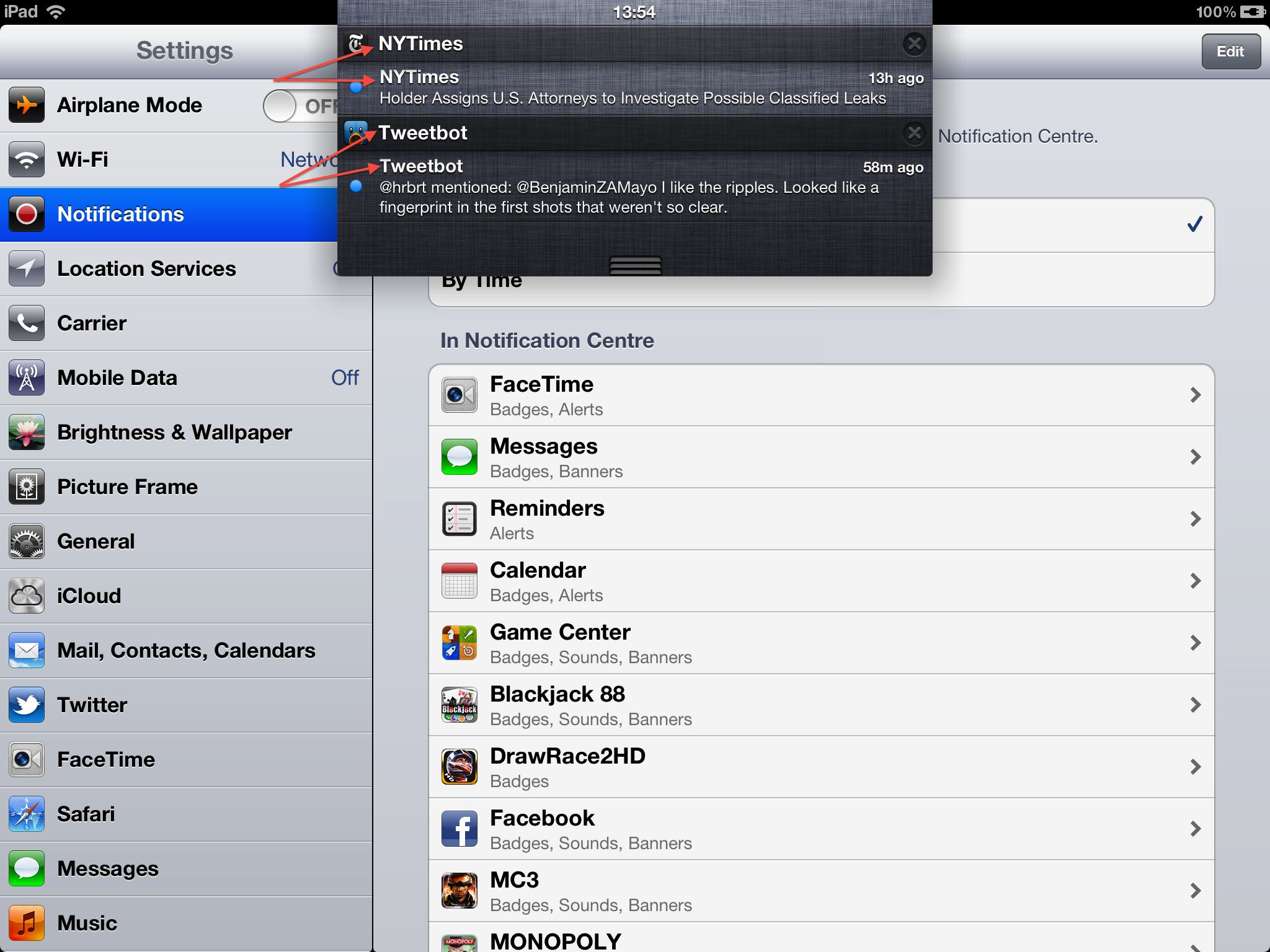
My biggest issue with Notification Center is the repeated text. As indicated in the screenshot, “NYTimes” appears once in the header, and once for every NYTimes app notification. The same applies for Tweetbot; this results in a lot of repeated text. In my opinion, this space could be put to better use.
If Apple could let developers set a subtitle for each individual notification, Notification Center would improve functionally and aesthetically. For instance, for the Tweetbot notification, it would be easier to identify the content if the subtitle was something like “Mention from @hrbrt”, rather than just repeating the app’s name. A quick glance could determine whether a notification requires further action, rather than having to read the smaller body text. It is also better aesthetically, simply because it looks nicer, as there is no repetition.
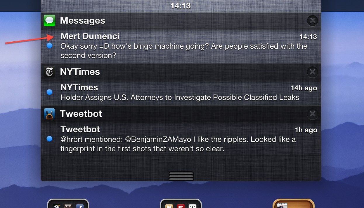
As shown below, Apple’s own apps already do this.
For example, the Messages notifications are much more informative, as they include the receiver’s name as the subtitle, rather than just repeating “Messages” again. This allows you to see, at a glance, the message’s sender without having to squint to see the smaller text beneath.
Therefore, I hope Apple will add this functionality to third-party iOS developers, in the future, as it not only makes Notification Center simply look better, but also has a functional improvement of adding more context to incoming notifications. In many ways, it seems inevitable, as Apple’s own apps already do it. It is simply a matter of opening up the feature to other developers.