My Biggest Gripe With iOS Notifications

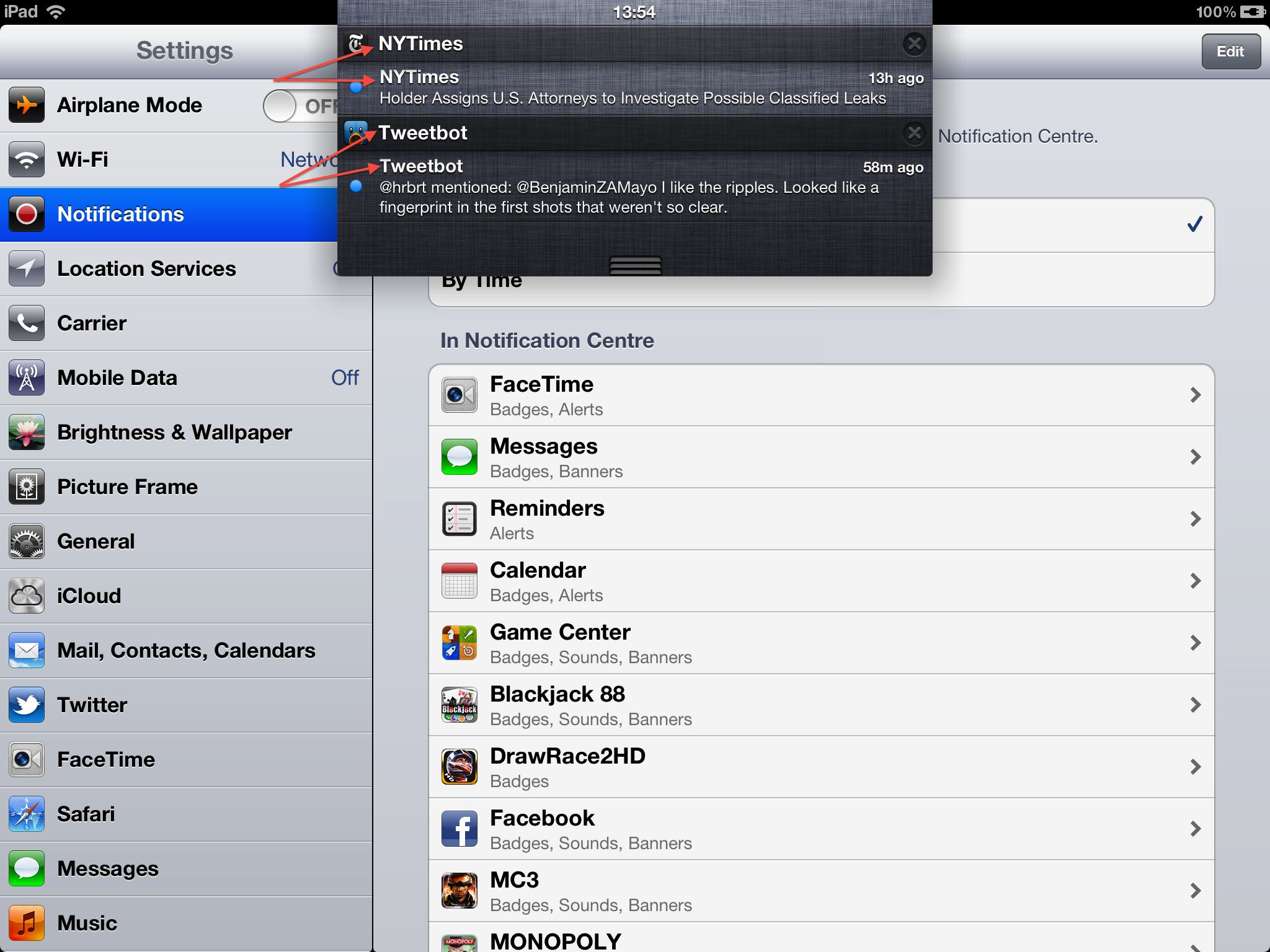
My biggest issue with Notification Center is the repeated text. As indicated in the screenshot, “NYTimes” appears once in the header, and once for every NYTimes app notification. The same applies for Tweetbot; this results in a lot of repeated text. In my opinion, this space could be put to better use.
If Apple could let developers set a subtitle for each individual notification, Notification Center would improve functionally and aesthetically. For instance, for the Tweetbot notification, it would be easier to identify the content if the subtitle was something like “Mention from @hrbrt”, rather than just repeating the app’s name. A quick glance could determine whether a notification requires further action, rather than having to read the smaller body text. It is also better aesthetically, simply because it looks nicer, as there is no repetition.
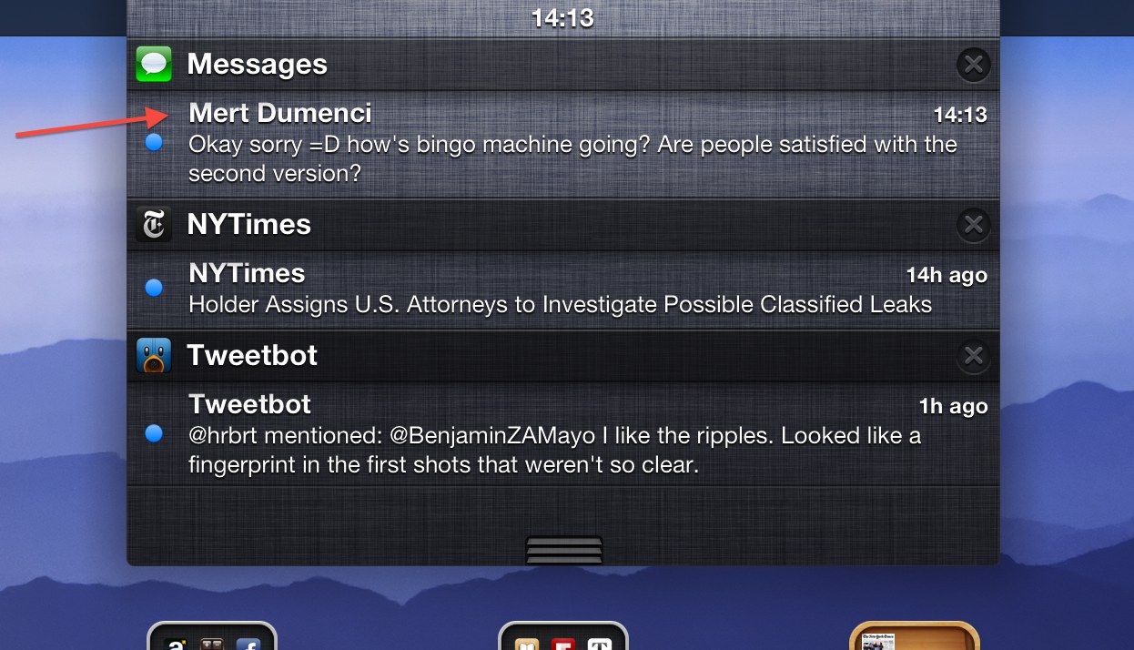
As shown below, Apple’s own apps already do this.

For example, the Messages notifications are much more informative, as they include the receiver’s name as the subtitle, rather than just repeating “Messages” again. This allows you to see, at a glance, the message’s sender without having to squint to see the smaller text beneath.
Therefore, I hope Apple will add this functionality to third-party iOS developers, in the future, as it not only makes Notification Center simply look better, but also has a functional improvement of adding more context to incoming notifications. In many ways, it seems inevitable, as Apple’s own apps already do it. It is simply a matter of opening up the feature to other developers.