In addition to launching a smaller, cheaper Assistant smart speaker this morning, Google also unveiled the Google Home Max. Larger than last year’s Home, it features stereo speakers and a more premium design.
On the audio front, there are dual 4.5-inch high-excursion woofers with “custom” .7-inch tweets. The speaker cover is made of an “acoustically transparent fabric,” while there is a rigid polycarbonate housing. Google notes that the Max is 20x louder than the Google Home. Users can connect speakers via Cast, Bluetooth, or aux jack.
I’d be shocked if they sell more than a few thousand of these. It is expensive. At $399, it’s positioned at a price even higher than the HomePod. It’s also really expensive relative to the rest of the Google Home line.
Google already sells far cheaper smart speakers; in fact, they just announced a $49 Mini. I reckon that most people interested in a Google smart speaker product will just buy what’s cheap, and be very happy. The Max is a premium option that very few people will shell out for.
Similarly, Apple would sell far fewer $349 HomePods if they also sold a $199 model that had worse sound quality proportional to its lower price.
Nevertheless, ignoring market viability, I think the Max is pretty cool. The form factor is neat. It has a magnetic rubber foot that can attach to the short side or the long side. In its default horizontal appearance, it looks like it is meant to be used as an oblong. Yet, you can pair it with a second unit, orient them vertically, and it looks like it meant is to be used that way round reminiscent of ‘normal’ stereo speakers.
As with all the smart speakers that emphasise their music capabilities, it’s impossible to know how it stacks up without hearing it in person. Both this and the HomePod ship sometime in December — it will make for an interesting comparison.
Visual Codes creates QR codes that anyone can scan using their iPhone camera app. Send links, add a contact or even connect to WiFi, just by scanning a code. Only the person who makes the QR code in the first place needs to download Visual Codes app; any iPhone or iPad running iOS 11 automatically scans the code through the native Camera.
That’s the pitch. Here’s the backstory. I have definitely mocked QR codes in the past so at face value, it’s a bit hypocritical to then go and make an app that centres around them as a concept.
However, what changed my view is iOS 11 integration of a QR code reader at the system level. Becoming a first-party feature helps a great deal and reducing the friction of using a QR code. No third-party apps to download and launch, users simply open the Camera (which is instantly accessible from the lock screen) and point it at the QR code.
The QR format space is messy; there isn’t really one official standard on how a message payload is encoded into a QR image. The design elegance of Visual Codes is that I picked Apple’s implementation in iOS 11 as the ‘standard’ to write against. I can promise to support what iOS does, and nothing else. I can test against the devices I own and comfortably address a large audience (any iOS 11 device).
If the generated codes work on other platforms, then that’s great. If they don’t, I’m not going against the app’s premise. Incidentally, most of the codes will work with Android which is a nice sweetener.
Visual Codes is a niche app with a couple of obvious use cases (like creating a QR code for your home WiFi network) and then a wide space of potential niche applications. Marketing such an abstract generic utility is hard. The app is freemium for precisely that reason: people can try it out without having to decide if it is worth paying for.
The app was a fun project to make. I pushed hard to make the 1.0 not require a web connection at all. It’s refreshing to work on apps that don’t need to worry about networking; there’s just a lot of boring stuff that I didn’t have to concern myself with. Instead, I used the extra development time to experiment and play around with features like SiriKit and rich keyboard list navigation.
I think that was a good decision. If I had forced myself into networking for the 1.0, I might not have ever shipped it. I probably would have got bored debugging a synchronisation issue and given up on it entirely. The flexibility to abandon something is a blessing and a curse when it comes to side projects.
Of course, the most-requested feature since the app launched yesterday is cross-device iCloud syncing of libraries. This is something I obviously want to add. At least now, I have the motivation of a (partially paying) user base to satisfy when I inevitably hit a wall in the CloudKit implementation.
In terms of the interface design, my limited resource budget stunted some of the things I wanted to achieve. I scrapped plans for a custom iPad layout (likely revolving around a grid view for the main screen rather than a stretched-out list) and limited myself to only small tweaks for the tablet size class. My compromise was to make the app look good on the iPhone and in the iPad floating multitasking window.
The transition from code library to detail view is hacked together but it looks great and smooths out the navigation experience. I’m really proud of the custom Print interface with dynamic previews, I think it looks great and exposes a lot of advanced functionality without getting lost in configuration panes.
A secondary motivation for releasing Visual Codes was to have a shipping app that uses my open-source frameworks, dogfooding as it were. Until this year, I had no open-source repositories to my name. Now, I have two meaningful contributions to the open-source iOS community in the wings. Although I am yet to formally announce them, they aren’t exactly hidden so if you are that interested you can check my Github profile. I want to properly ‘reveal’ one of them later this week.
In general, response and media coverage of Visual Codes was way higher than I ever expected it to be. I am really grateful to anyone that downloaded it, and especially thankful to those that have already bought the upgrade. I am aware of some teething problems in the 1.0 release (people use really weird names for their WiFi networks!) but I’ve already pushed a bug fix update through to App Review. Such is the life of an app developer. I love it.
I don’t think Apple’s marketing of the iPhone X as the ‘future’ is really appropriate. Android manufacturers have gone far down the bezel-less line for a year now. The iPhone X is more drastic, boasting the highest screen-to-body ratio of any phone, but it doesn’t feel like something that should be applauded as debuting the technology of tomorrow, today.
This kind of design is what I expect top-end phones to look like in the here and now. Despite the X and 8 sharing so many component upgrades (SoC, camera, True Tone), I feel like I will never be able to recommend an 8 to anyone. I am so done with bezels, foreheads and chins.
For people needing a new phone, I would seriously consider saving money and picking up a discounted iPhone 7 or 7 Plus if the X’s $999 starting price puts it out of reach. Maybe carriers offer good promotions for iPhone 8 series that could tip the balance; I just know I do not want to pay full price for a bezelled device. Alternatively, hold off on upgrading until you can afford the X tier phones (whether that’s three months or next year).
This sounds negative but it is really a commendation of how much better the iPhone X is as a product. The design is beautiful. This is what I’ve wanted for a year and a half. The concept of a screen that traces the edges of the chassis is as good as I imagined it to be.
The iPhone X doesn’t fully realise that idea, of course. It has the already-infamous notch area at the top of the screen. A future generation of this phone will not have a notch, making the vertical symmetry as perfect as the horizontal. That is years off, though.
Waiting to realise the vision in its entirety would have been a mistake. Putting all those components below the display is going to take at least another three years of development. It’s not feasible to sit on a radical new iPhone design for that long. The other option would have been to take an Android-esque approach: no bezels on left and right with a slimmer top forehead and bottom chin.
The notch brings its own downsides, particularly with landscape layouts, but going all the way to the edge, mirroring the rounded corners of the body, is impressive, fresh, cool and a competitive advantage. Apple are the first manufacturer to achieve this look and it makes them stand out. Going with a typical candy bar style would have drawn criticisms that they were copying Samsung and the design had no unique characteristics.
It’s a nuanced discussion that will no doubt span months of conversation but that’s my guess at the high-level business chatter. Luckily for me, the conclusions match up with my personal preferences of what looks good. I hope iPads, MacBooks and iMacs adopt these style of screens as soon as possible. I can’t wait to see the iPhone X in real life.
Whilst everyone on Twitter rattles on about the sensor housing placement, I take more offence with the home indicator. I don’t even have the phone yet and I already want it to never be there. Right now, iOS 11 always shows the home indicator apart from a few select cases where it can be temporarily hidden, like watching a full-screen chrome-less video. This is a sensible default, the mainstream population will benefit from having a permanent visual cue for system navigation.
But I’m technically minded, I won’t forget to swipe up from the bottom of the display to go back to the Home Screen. For me, that indicator is wholly redundant and offers basically no value in exchange for limiting usable screen space for actual content. I hope a future iOS update adds a toggle in Settings to permanently hide the indicator.
The ramifications of dropping Touch ID for Face ID are hard to reason about until I have an iPhone X to use. For now, I’ll take Apple’s marketing of its convenience at face value. I’m sure there will be times when I miss the ergonomics of fingerprint recognition and other times when I appreciate the benefits of facial recognition. I would not rule out a return of Touch ID at some point, when they can eventually integrate it seamlessly behind the screen.
Pricing for the iPhone X is pretty much inline with what I predicted months ago; the most expensive model doesn’t exceed $1200. Amusingly, the iPhone 8 and 8 Plus actually cost $50 more than the 7 and 7 Plus did. Apple blames rising NAND costs for the increase. Regardless, it’s worth noting that the 6s and 7 phones stay in the lineup. Apple is defending against the price hikes at the high end by keeping around older generations. If some portion of the user base are drawn to lower tiers, that’s okay. There will be an influx of people spending more money than ever on their next phone to balance it out.
“Apple tends not to price far from the high end competition,” the analysts wrote. “With the Galaxy Plus at $840 and the Note at [almost] $950, we think a $900 price tag for the base OLED model makes sense.”
Apple doesn’t price their products in a vacuum but it’s not magnetically attached to what Samsung is doing, either. I think what UBS is overlooking here is that the ‘7s’ iterative models will keep Apple competitive at the same price tiers they always have. The OLED phone doesn’t have to fight off all cheaper competition; if you want a ‘normal priced’ new phone you can consider getting a 7s or 7s Plus.
The OLED iPhone is clearly going to be positioned as a premium device that appeals to anyone interested in buying brand new iPhones. In my mind, this means it has to be more expensive than the most expensive iPhone that exists today. That’s the floor. The ceiling is the level of affordability that allows Apple to attract the millions upon millions of sales they want, for people that want to stretch their wallets.
That means Apple will start pricing above what the maxed-out 256 GB iPhone 7 Plus costs today, $969, but not too much more. With those conditions, $999 for a 64 GB iPhone 8/Edition/whatever seems right to me. The higher end storage tiers would add another $100 like always. Every current iPhone user pays at least a little bit more for the new best model but it isn’t wildly out of reach to anyone either.
Across the bottom of the screen there’s a thin, software bar in lieu of the home button. A user can drag it up to the middle of the screen to open the phone. When inside an app, a similar gesture starts multitasking. From here, users can continue to flick upwards to close the app and go back to the home screen. An animation in testing sucks the app back into its icon. The multitasking interface has been redesigned to appear like a series of standalone cards that can be swiped through, versus the stack of cards on current iPhones, the images show.
I’m very much surprised that Apple is taking such a big stride here. Until Gurman’s story, I was working on the assumption that Apple would take the obvious path when it removed the physical home button. That would mean drawing a circular button in software in the same place where the button would normally be.
Apart from the removal of the indentation, the navigation would be the same. Click to go to the home screen, long press to activate Siri, double tap for multitasking. Instead, Apple is doing something much more drastic based around edge-swipe gestures.
Whilst the description of how it works sounds reasonably intuitive (although there are gaps in this report about some of the finer details), it is different enough that the usual appeal of a new iOS device (‘you already know how to use it’) won’t apply.
It will be especially weird in Apple Stores, where the company will sell two new iPhones with very different navigation interactions (the 7s phones retain the home button, so it’s just the OLED phone getting the new swipe gesture stuff).
On the other hand, assuming that this is the ultimate direction for all iOS devices eventually, rolling out new and ‘hidden’ gestures to a high-end model first is perhaps the best transition plan Apple could pull off. By its premium nature, the iPhone 8 will be bought by a lot of early adopters and techies first, who are more accustomed and responsive to change. That group can lead by example, almost, before the new UI is used by the more mainstream population. People will see iPhone 8 users in the wild and acclimatise to it, if only subconsciously. It’s not seamless but it certainly helps bridge the gap between the two paradigms.
So I think Apple needs to make a decision here: either push the Touch Bar/TouchID system out to the entire Mac Line via a new Keyboard, or they need to expand their laptops with a line of devices without Touch Bars.
The current laptop line forces users to pay for the Touch Bar on the higher end devices whether they want it or not, and that’s a cost users shouldn’t need to pay for a niche technology without a future. So Apple needs to either roll the Touch Bar out to the entire line and convince us we want it, or roll it back and offer more laptop options without it. I’m going to be curious what they do if/when they announce updated Laptops this fall.
Whether you like or despise the Touch Bar, you can’t say it’s “technology without a future”. Apple knows its own trajectory, no one else. I don’t think they have shown any suggestion of abandoning it (the 2017 MacBook Pro lineup retained the Touch Bar for a start).
In fact, the Touch Bar has a clear path of iteration ahead of it. Make it cheaper, roll out to lower-end Macs, add haptic response, and ultimately take over the whole keyboard with one giant screen. The current utility of the Touch Bar is small but it doesn’t compromise the machine, aside from the price hike. I don’t use the Touch Bar for much and I don’t regret it in the slightest. I love being able to control volume and brightness as a slider by just sliding my finger along the track.
Apple probably needs to re-think some of the dynamic interfaces — even a year later, I can’t train myself to use it when I’m flitting between so many different states and applications. Even so, it’s not a dead-end feature by any means.
Pushing Touch Bar into lower-end MacBooks will be a big win for Apple. I strongly believe that the Touch Bar is better suited for novices than professionals; it is far more useful to people that have to stare down at the keyboard to type.
The Essential Phone has the most appealing hardware design of any phone I’ve used in at least a year. Everybody’s taste is different and so this is mostly my own personal aesthetic judgement, but it’s a strong one. I simply like holding and using this phone, and I love that it is unapologetically rectangular. The Essential Phone weighs about as much as an iPhone 7 Plus, but, as I said, it’s much smaller. That makes it feel substantial, actually dense.
If iOS disappeared today, this is the Android phone I’d get. No frills, no weird gimmicks and no preinstalled crapware. It even upstages Apple on minimalism; the chassis has no logos at all.
On the bezel scale, the Essential phone gets a pretty good score. There is a top-edge notch for the front camera — it’s smaller than the upcoming OLED iPhone’s notch because it’s just a cutout for the pinhole camera whereas Apple is incorporating the earpiece and depth-sensing Infrared cameras in that area.
The Essential’s screen-to-bezel ratio is let down on the bottom edge. It has a noticeable chin. The appeal of the iPhone 8 is that its only front-face concession will be the notch. What amazes me is that Google’s imminent Android flagship, the second-generation Pixel, has a huge forehead and chin. They have missed the boat, big time.
The other new development is Kuo expects Apple could omit phone call capabilities from the LTE model of the new Apple Watch. You can already make phone calls from the Apple Watch when it’s paired with a nearby iPhone and there’s no technical limitation with the implementation, but KGI expects Apple may want to improve the “user experience” of data transmission before enabling voice services.
This would be a big letdown. Taking calls in your headphones whilst working out is a major feature for a hypothetical connected watch. Listen to music with AirPods, songs streaming from your wrist, with the comfort of being connected if something urgent happens with work or family.
Moreover, Kuo’s logic for this feature not being present is strange. He says that not including voice service simplifies the internal antenna design, as it doesn’t need to support 3G spectrum, just LTE. It makes sense that Apple would want to be selective in the name of miniaturisation. What I don’t understand is why exclusively using the LTE network means the watch cannot support voice calling at all. Many carriers nowadays run voice and data over the LTE network.
Also, for some time, Apple has offered a remote Handoff feature for phone calls on select carriers. If you are on AT&T, for instance, you can leave your phone at home on WiFi and pickup calls on your iPad and Mac — from anywhere. Cellular or non-cellular, another Apple device can take the call. Why can’t the Watch do this? It surely doesn’t matter what wireless data protocol the underlying hardware is transmitting across.
Equipped with LTE chips, at least some new Apple Watch models, planned for release by the end of the year, will be able to conduct many tasks without an iPhone in range, the people said. For example, a user would be able to download new songs and use apps and leave their smartphone at home.
Apple is already in talks with carriers in the U.S. and Europe about offering the cellular version, the people added.
I think pretty much everyone would see benefits from the Apple Watch gaining a cellular connection, and it would easily be the most popular model of Watch if there were no strings attached beyond the upfront sale price.
That isn’t the case, though. The carrier situation is the crux of this product. It is very unlikely that LTE service on Apple Watch would be free. An Apple Watch has the potential to eat up a lot of data: you can make FaceTime Audio calls, download videos and photos over iMessage, stream music and much more.
What monthly contract price is acceptable for this ancillary device? US carriers let customers add tablets to their phone plans for $10 per month. Could carriers charge $10 per watch? That seems exorbitantly high. Maybe $5 a month is low enough not to deter buyers.
I could maybe see Apple negotiate a special super cheap deal with an underdog carrier that is very inexpensive but functionally limited. T-Mobile is the kind of carrier that I can envision being open to something like this; a $1/month deal that allows Watch users to get email, send iMessages and sync reminders … but still requires a paired phone for data-hungry services like FaceTime Audio calls and Apple Music.
Unfortunately, that kind of arrangement requires tough negotiation and even if they get someone to say yes, only applies to a select region of the worldwide. Perhaps the cellular Apple Watch will kickstart a new subsidised smartwatch market with ‘unlimited’ data, lower initial costs, and two year contracts.
Speaking about oneself for a moment, I have no interest in a cellular Watch where I have to pay anything above a couple pounds for a data plan. My current SIM-only phone plan costs me £8 a month; I am doubtful the cellular Watch contracts will be inexpensive relative to that level.
What also remains uncertain is how Apple will redesign iOS 11 to accommodate the ‘cutout’ at the top of the display which exists to accommodate the front facing camera and sensors.
What Nodus and I believe is the remaining corners will simply be used for connectivity and battery status with notifications switched to the bottom in a new easier-to-reach and more detailed ‘Function Area’.
These are the best renderings I’ve seen that illustrate the idea of marrying the physical notch with the software status bar. As ever, there are couple conceits.
First, this image is conveniently depicting the iPhone lock screen. It completely dodges the question of how Apple will handle showing the time in the status bar area. A holistic, real, design would have to consider where the time goes in general. Obviously, it can’t go in its standard status bar location because that space is where the front camera/sensor array is. A mockup that ignores this essential part of the experience is very lacking; it is skipping over a critical element of the concept.
Whilst this is a neat idea, I am not convinced that Apple will actually do this fake bezel thing on the lock screen at all. It’s such a waste to have this beautiful full-frame OLED display with rounded corners, only to hide the top two edges at all times. I think Apple will want to let the user’s wallpaper fill every possible pixel; retaining the symmetry of four rounded corners will be very visually impressive. Let the design be true to itself.
I imagine this would be the case on the lock screen and the home screen. In apps, a fake bezel approach is more likely but not a sure thing by any means. I imagine that the iPhone 8 will effectively have a permanent double-height status bar when inside apps; some of the status bar icons will go in the ‘ears’ and the rest flows into the second line. The time would therefore be centred beneath the notch.
If it’s true that Apple is going to release three new iPhones, my bet is that they’re named the iPhone 7S, iPhone 7S Plus, and iPhone Pro. And I hope the iPhone Pro starts at $1500 or higher. I’d like to see what Apple can do in a phone with a higher price.
‘Hoping’ for a more expensive iPhone isn’t the best way to phrase the wish but I think I understand the sentiment: Gruber wants an iPhone equivalent of a MacBook Pro rather than MacBook.
The iPhone 8 isn’t that, though. There’s no way it is going to be $1500 plus. Numerous industry reports show that Apple has ordered more than 70 million OLED screens for this year alone. Apple is only shipping one phone with an OLED screen this cycle, the iPhone 8 (or Pro, or whatever it is called). The display orders alone show that this is a mass market device, more premium than the current status quo but still in reach of anyone who has bought a high-end iPhone before.
$1500 is out of that range. At $1500 (“or higher”) Apple would sell some units, millions in fact, but not tens of millions. The price level is simply prohibitive. In contrast, selling 70 million iPhones with a price circa $1000 in under a year is possible. I do not expect the most expensive model of iPhone 8, with the biggest storage size, to exceed $1200 (excluding taxes).
It would be different if the new phone was made of ceramic, or gold. It isn’t. It’s stainless steel and glass; beautiful premium materials but not ones that are exclusively expensive.
“We predict the OLED model won’t support fingerprint recognition, reasons being: (1) the full-screen design doesn’t work with existing capacitive fingerprint recognition, and (2) the scan-through ability of the under-display fingerprint solution still has technical challenges, including: (i) requirement for a more complex panel pixel design; (ii) disappointing scan-through of OLED panel despite it being thinner than LCD panel; and (iii) weakened scan-through performance due to overlayered panel module.
I hate when Kuo publishes something controversial or unexpected. If this was any other source, fantastical ideas like the removal of Touch ID entirely can simply be dismissed as a far-out wild claim by a random stranger. You can’t disregard what Kuo has to say because his record is so good. Historically, if you bet against Kuo then you’d lose far more than you’d win.
This is a scenario where I want to disagree with Kuo. Losing Touch ID on the iPhone would be insane and I can’t envision the best facial recognition system in the world replacing the convenience and versatility of a fingerprint sensor. There are so many times when I use an iPhone off-axis where the front-facing depth-sensing camera simply wouldn’t be able to see me.
There is no doubt Apple was exploring under-display fingerprint scanners for the iPhone 8; Kuo confirms this and says that it was rejected for technical performance and yield reasons. However, what I cannot agree with KGI on is the fact the fallback ‘Plan B’ when the screen-integrated solution failed was simply not to include a fingerprint sensor at all. If Apple was investing so much into making the integrated reader work, surely they must see value in the phone having fingerprint authentication capabilities (in addition to facial biometrics).
I think the power button is the Touch ID fallback. In dummy iPhone 8 units seen as early as April, the power button is literally twice as long as it is on iPhone 7. It doesn’t look better aesthetically, so it must have a functional purpose: the button is a fingerprint reader. Sony phones have already demonstrated it is possible.
A few hours after the KGI report, Bloomberg writes that the ‘intent’ of the facial recognition is to replace Touch ID, corroborating Kuo. More interestingly, it says the feature is designed to work even when the phone is laying on a table as well as when gripped in the hand. If that is true, maybe Apple really can remove the Touch ID entirely and satiate all users with the new face biometrics authentication instead. Apple advanced the industry when it first deployed Touch ID back in 2013, no doubt. Nevertheless, fast and reliable facial recognition from a distance sounds like a fairytale.
Let me be clear: I have no reservations about Apple’s ability to release facial recognition that is as secure, as fast, as accurate and as reliable as its industry-leading Touch ID. My hesitation is a simple matter of ergonomics. My iPhone is on the desk. I am sitting in my office chair. With Touch ID, I can unlock my phone as I tap the button to turn the screen on. How is a front camera or 3D sensor going to be able to detect my face at this oblique angle? It just seems impossible.
The new social feature starts from the For You tab right below the New Music and Favorites playlists. You can see albums, playlists, and stations played by friends you follow, and below that you can find friend recommendations for more people to follow.
Recommended music will show the avatar of the friend or friends who played it, and you can tap through to see links to their full profile as well. Using your real profile picture helps when names aren’t presented, and some users (Apple execs so far) even have verified profiles.
Behold, the first Apple social music attempt that isn’t going to be flop. Unlike Connect, this isn’t a clone of a Twitter or Facebook feed. The Music app passively records what songs are played and publishes the music as recommendations for other users to see and follow.
The recommendations appear in the For You tab, the same place Apple Music subscribers already check to discover new music to listen to. Aside from initial profile setup and finding friends, there’s not much to do … which is a good thing. People are going to use it because the barrier to entry is so low.
It’s appropriately lightweight. Connect and Ping failed because they built out an entire status feed system inside of Music, offering no benefit over the established social networks that people already use.
In the best case for Apple, an Apple Music member upgrades to iOS 11, finds some new music they like from what their friend was listening to, thereby extracting some additional value from their membership and makes them more likely to renew their subscription.
Despite being branded as what “Friends Are Listening To”, the service shows verified badges for well-known personalities. It will be interesting to see if Apple encourages music celebrities to join the service so users can follow along with the musical tastes of their favourite artists. In the beta, the badge can be seen on the Apple executives’ profiles. Amusingly, whilst Eddy uses his Twitter @cue handle, Phil Schiller has opted to be known as ‘technorambo’.
The main difference between the iOS 9 and iOS 10 Control Centre was the separation of audio controls into their own page, an intentional move to lower the amount of stuff on screen at a time, splitting audio controls into their own page. The iOS 11 revamp is a harsh swing in the opposite direction, incorporating more buttons than ever into a single view.
The new design packs an assortment of different buttons and sliders into a tight space, a grid of irregularly sized blocks reminiscent of a Tetris game. When I first saw it, my eyes didn’t know where to look. The stacked widgets eschew the linear hierarchy of the previous incarnations and my first impressions were not very favourable.
Each individual platter on the screen looks decent; some of the icons even animate in response to state changes for a nice touch of whimsy. Holistically, the layout is messy.
I retracted my negativity after a couple days of using it. I had to consciously remind myself that this part of iOS is compartmentalised for a reason; it serves as a convenience dashboard to perform common tasks and adjust frequently-used settings.
Writing that down sounds pathetic — it’s such a trivial observation — but once I reaffirmed to myself what the basic premise of the Control Centre is, I could overlook the weird layout and appreciate the functional benefits of the new approach. Glancing at Now Playing, perhaps pausing the song or skipping a track, without having to worry about what page I am on is a huge win.
iOS 10 brainwashed me into thinking that one additional swipe to change page was a reasonable price to pay. I feel silly now for thinking that was acceptable. With a specific goal of access to quick actions, any Control Centre design that involves fewer intermediary interactions has to be superior.
It isn’t just about removing the need to swipe, the mental assessment of the current state of Control Centre also falls away. Your brain can rely on the button always being there. As soon as you finish swiping up, your finger can instantly start moving to the learned position of the Play/Pause button (for example).
After a few days of using iOS 11, muscle memory takes over. I can pause music with my eyes closed, something that wasn’t possible with iOS 10 because I wouldn’t know if Control Centre was on the first or second screen.
The switch from a rigid card design to a free-flowing grid enables additional features and flexibility. iOS 11 lets you add additional actions to show in Control Centre via Settings. New buttons appear in rows at the bottom of the screen as existing controls shift upwards to accommodate. You can even change the order of the square shortcuts by dragging the items up and down in the Settings list. In the future, it’s easy to see how Apple could add free-form customisation of the entire modal panel, letting users drag and drop widgets just like apps on the Home Screen.
If this design motif carried across to the main apps, I would not be happy. It lacks coherent structure and clean appearance that a real application needs, but it is well suited to Control Centre. The vertical stack will neatly reflow into the upcoming 18:9 extra-tall ‘iPhone 8’ screen too. I am onboard with this.
Another usability improvement with the new design is the sliders. Changing volume and brightness has to be the most-used actions for Control Centre and the new layout emphasises their importance. The previous iterations of Control Centre used generic system sliders for these controls, oriented horizontally with a small nub and even-smaller track.
iOS 11 uses non-standard slider controls to great effect. The sliders are bulbous and almost as wide as an average human finger — your finger can’t miss them. I also find it easier to drag things up and down rather than left and right. I have accidentally dismissed the Control Centre when I meant to turn down the brightness a couple of times, though.
I don’t want to give the impression that the new design has no flaws; the number of taps required to switch audio output is a frequent frustration. Few things are truly perfect. What I can say is that my knee-jerk response to the ‘slap-dash’ appearance didn’t play out in practice. This is a better direction for Control Centre than what iOS 10 offered.
…let’s be clear: Drag & Drop is enabled with pref keys on iPhone. It’s not like they haven’t built it. They just don’t think we want it
It would be silly to remove Drag & Drop from iPhones for a year just to let iPad shine. Nobody’s choosing an iPad over iPhone because of D&D
iOS 11 drag and drop on the iPad is really great. It speeds up a lot of common tasks and it makes those tasks direct and easier to achieve. Rather than digging for context menus that aren’t yet visible, a long-press anchors the content to your finger ready to be dragged and dropped pretty much anywhere in an updated application — even crossing sandbox boundaries into a different app than the one from which the content originates.
Apple allows developers to add drag-drop interactions inside their own apps on both platforms. On the iPhone, the system enforces that dragged content cannot escape the boundary of the containing app.
However, it seems like drag and drop is discouraged in general on the iPhone as none of the system apps support it despite deep integration in the corresponding iPad apps. The Home Screen enables it on iPhone to speed up the process of rearranging apps, but that’s about it.
Steve Troughton-Smith found the various runtime keys that dictate this behaviour. Naturally, he then modified the Simulator resources to demonstrate how drag-and-drop on the iPhone would look if it was turned on.
Apple has done the engineering work to support drag and drop on the iPhone, so the pertinent question is why is it disabled. Troughton-Smith argues that marketing is driving the decision, allowing Apple to put the spotlight on the iPad for a change.
I am not convinced that marketing is the primary reason. There are usability issues on the iPhone that don’t bubble up on the iPad form factor. There are design considerations to weigh up.
The best uses of drag and drop on the iPad necessitate multi-finger interactions. Typically, one hand holds onto a stack of content whilst the other navigates the rest of the interface to find the destination app.
Multiple touch input isn’t a gimmick, it’s critical part of the experience. Here’s the cinch: the iPad form factor is far better suited to this type of interaction. The screen is spacious and users usually rest the device on a table or lap, leaving both hands available to touch the screen.
In contrast, the iPhone canvas is small. Fingers take up a large proportion of the display and the shadows of their respective hands obscure even more of the visible screen. It’s just not as good for complex gestures. Example: reach to a point towards the top of the iPhone screen with your thumb and notice how hard it is to press the Home Button with another finger.
I bet the rate of erroneous drops would be significantly higher on iPhone compared to iPad as users trips over their fingers and struggle to see exactly what they are hovering over.
Moreover, handling the phone is typically a one-handed experience (at least for 4.7-inch and soon to be 5.8-inch iPhones). Expecting phone users to regularly commit to two-handed interactions is a tall order.
I’m sure these practicality issues must have played a role in the internal conversations, debates and ultimate decision to disable most of the drag-drop features on the iPhone. I would be shocked if the only thing blocking this was the marketing team’s desire to prop up the iPad; maybe it was a side benefit.
In the end, the cut/copy/paste context menu has served iPhone users well for the last umpteen years and I don’t see that much motivation to shake things up. The iPad is a different beast entirely where its users were starving for new ways to boost their productivity.
Split View side-by-side apps is another big differentiation. Split View is incomplete without drag and drop to move things from one side to the other, so much so that the iPad felt broken without it. The iPhone doesn’t have Split View which means the lack of drag and drop is significantly less impactful; it’s a nice to have rather than necessity.
I would be surprised if Apple ends up enabling the complete drag and drop experience on the iPhone in the near term. Enabling it is not zero cost; drag and drop overloads long-press gestures which adds some additional complexity to every user of the iPhone. The iPad is impaired by the same downsides, of course, but it has much more to gain from the feature’s inclusion.
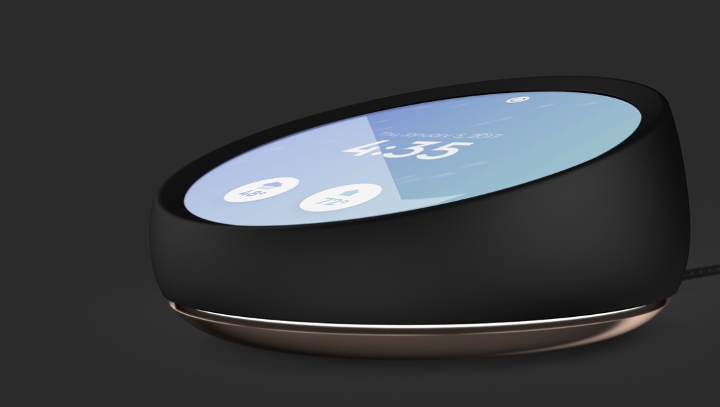
The idea behind Essential Home is that technology is there, supportive, and proactive enough to be helpful, without forcing you to ask or type a question. It’s in your environment; you can tap or glance at it, but it never intrudes or takes you away from the things that are important to you.
The Essential Home is vapourware at this point: no firm release date or price, work-in-progress operating system, incomplete public reveal, and spurious claims about HomeKit integration that I doubt will ever materialise.
We don’t know much beyond this picture of what the hub looks like. That’s the truth. With that in mind, this is a better execution of the assistant-with-a-screen hardware product than the Echo Show appears to be. It’s far more discreet in its form — the screen turns off completely when not in use — as an object and looks modern in a way that the Echo Show really doesn’t.
When I look at the marketing materials for the Echo Show, I can’t shake the memory of a 90’s CRT television from my mind. In stark contrast, the industrial design of the Essential Home is futuristic (round screens are cool). It makes a visual statement without being gaudy.
Obviously, the product itself will probably be a flop as the company will get crushed by the Amazon, Apple and Google juggernauts of the industry when it comes to the software stack and platform integration. I guess what I’m saying is: Amazon should have designed the Echo Show like this.