MacStories Imagines Possible iOS 11 iPad Features
Like last year, I collaborated with Sam Beckett to visualize my ideas for iOS 11 on the iPad with a concept video and detailed mockups. This time, instead of showcasing our ideas as standalone concepts, we imagined a “day in the life” theme for the video, showing how enhancements to iOS for iPad would work in practice. Rather than showcasing random bits of possible features, we imagined an underlying task to be accomplished (planning a vacation in Barcelona) and how better iPad software could help.
I’ve been thinking about some of these ideas since iOS 9 (you can see a thread between my iOS 10 concept and this year’s version), while others would be a natural evolution for iOS on the iPad. Once again, Sam was able to visualize everything with a fantastic concept that, I believe, captures the iPad’s big-picture potential more accurately than last year.
The concept imagines major enhancements to several parts of the iPad experience, with fantastic production value and care given to the video and accompanying explanation. The video is a perfect rebuttal to the sizeable group of people who claim that iOS is mature and Apple should move on to the next thing. This concept shows the sheer immense scope of work left to be done, a glimpse at the number of interaction problems still unsolved and suggests several places where iOS’ fundamentals need to be rethought for iPad.
I’m not saying I endorse every single idea here, I have concerns about the addition of even more compartments and sliding doors to the iPad interface system. Any change to the core of how things on the iPad work requires a lot more consideration about implementation and practicality. Of course, it is not MacStories’ job to work that all out. It is Apple’s.
What I hope has happened internally on the iOS teams over the last several years is a serious consideration of metaphors like the Shelf. If prototyping and testing was successful, then these ideas should materialise very soon. If the features turned out to have drawbacks and roadblocks, as I suspect they might, then that is fine — as long as Apple went back to the drawing board and kept working to find alternate, better, answers to the same big problems. I think there has been a reasonable time period for that process of internal development to take place. If iOS 11 does nothing or very little to enhance iPad productivity, I will be sorely disappointed.
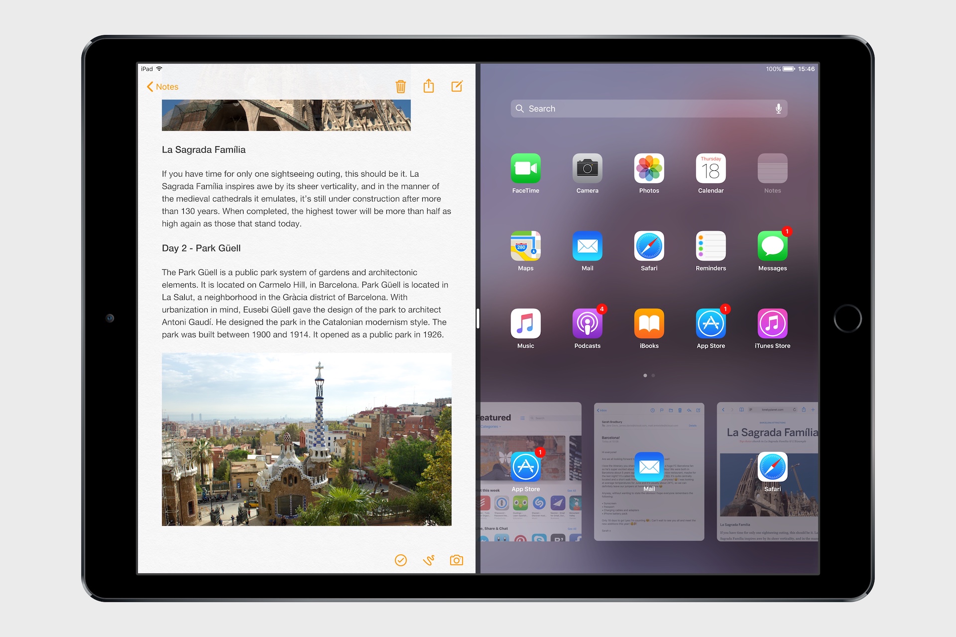
I picked the header image of this post carefully; it depicts a new take on the app switcher. At this point, a redesigned app switcher is effectively low-hanging fruit — the current version is so barebones that you don’t have to think very hard to best it. This is the case where I would be most confident in saying that Viticci and Beckett have envisioned a sure-fire win; a grid of user-arranged apps for quick access, a carousel of recently used apps, and a mechanism to activate the app switcher from the left or the right. I like the way the status bar items have been shifted to accommodate the multitasking divider, too. Maybe the switcher should show a shrunken version of the user’s actual home screens instead of a separate distinct grid, eliminating the mental user burden of another matrix of apps to manage, but that is up for debate.
As a nice double-whammy, the same screenshot also uses a thicker stroke width for the icons in the Notes app toolbars. The change is small yet the difference it makes is huge. Zoom in on the Share button and compare it to the same icon on your iOS 10 iPhone or iPad. It serves as a great example of where iOS 7 design is lacklustre and could be so much better with only minor tweaks. The stronger lines do not distract users from application content but the aesthetics are vastly superior.
The additional pixels in the strokes also enable the icons to feature rounded corners. One-pixel lines in the iOS 7-10 toolbar icons feel flimsy and sterile in comparison. Moreover, the MacStories icon set match the weight and curvature of the San Francisco font face. One improvement I would make: the font weight of the Back button text in the navigation bar should increase slightly to complement the emboldened ‘<’ glyph.