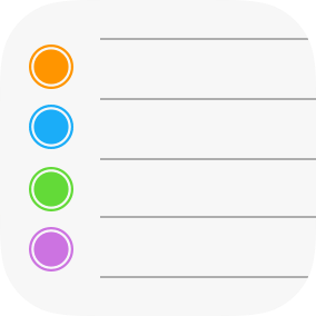
The iOS 7 Reminders Icon

In June, I jotted down my judgement on each iOS 7 app icon. Reminders is a standout failure. Apple hasn’t fixed it, so it’s time to elaborate on why it is worse.
On an iPhone or iPad, the icon is too discreet. The thin strokes and negligible colouring encourage your eye to skip over it because it is so bland. Frankly, it is too white. The other white iOS 7 icons, despite their flaws, ensure they have enough block colour to distinguish themselves. For instance, about a third of the Notes icon is solid yellow.
Even Calendar, arguably the icon that is most dominated by blank space, makes sure the coloured elements are centred in the frame. In comparison, Reminders’ speckles of colour are shoved into the left edge and easily overlooked. At smaller sizes, the bullet point dots become so small and insignificant that the icon might as well be pure white.
I also hate how the icon feels fragile. This is hard to convey in writing, but it really bugs me. For starters, the line rules are about two pixels tall. This sizing should be reserved for unimportant UI separators, not the focal point of your icon. The design language behind iOS 6 understood this, as the icon heavily favoured thicker strokes. The brittle sensation also comes from the fact the lines aren’t evenly spaced. The third rung (the gap between the third and fourth line) is shorter than the others, albeit only slightly. Still, I think the inconsistency is perceptible.
In addition, it is frustrating that Apple crams detail into icons that are overwhelmingly basic. Camera is the biggest perpetrator in this department, but Reminders exhibits the same flaw. For some reason, the bullets are outlined. When large, the icon looks silly because their isn’t detail anywhere else. When small, the detail is too small to not be visible, appreciated or even correctly interpreted.