Temple Run 2
I’m a big fan of Temple Run; I played the original avidly for almost a year and ended up recording a high score of 27 million. Temple Run was a ridiculously good success for Imangi Studios — Angry Birds successful — so I had assumed that a sequel would arrive at some point. It finally hit the App Store in the middle of last month.
My feelings on it have varied. Initially, I was definitely on the “terrible” side of the fence. The mechanics have strayed considerably away from what I was accustomed to with the first game. I remarked that all I wanted was a Temple Run 1.5 (the same core game but with updated graphics and some new abilities here and there). That is not what Temple Run 2 is — it is different enough to be disorientating.
In particular, the way the path moves put me off. They bend so much visually the instinctive reaction is that the game is expecting you to react with a gesture. It’s a hard reflex to overcome, being so accustomed to the original game’s rigidity for so long. My frustration level due to swiping my finger in response to a bend only to realise too late that it didn’t require a gesture was very high.
It certainly didn’t help that the game launched with some serious bugs. Inherent lag that I found to be consistent every time I played on the iPad. As you might expect from a game that requires twitch reactions in the later stages, the number of deaths I experienced caused by frame drops was not insignificant. There were countless other issues too, such as mediocre hit-detection on the ends of ledges and a glitch that meant I had to force-quit the app to be able to play another game.
In fact, the only reason I kept playing at all was peer pressure; I was competing against a friend for first place in the friends leader-board in Game Center. I was devoting hours to the game, but it would require an elephantine stretching of the truth to call the time I dedicated “enjoyable”. Put simply, death-by-arbitrarily-unbalanced-minecart followed by death-by-lagging-gameplay followed by death-by-getting-two-speed-boosts-causing-an-extreme-increase-to-the-player-movement-but-no-invincibility is not fun.
Anyway, fast forward a few days and the 1.0.1 update was released. Most of the frame rate problems were resolved (albeit many App Store reviews still say that they are experiencing frequent lag spikes) and I realised that my previous grumblings were overly harsh. The performance problems were hiding a really great revision to the franchise. The graphical improvements uncover a beautiful layer of charm (note the increased detail in the path, like the spattered stones, the non-rectangular obstacles, and the shadows refracting from the trees) that was absent in Temple Run. I now have a high score of 17 million and am proud that I haven’t caved and simply bought 500 gems through In-App Purchase.
There are still some gameplay bugs that need addressing, and are detailed thoroughly in the App Store reviews. Personally, my criticisms of the sequel have been distilled down to — essentially — small nitpicks. The following complaints have no meaningful effect on gameplay, but they are nevertheless annoying …
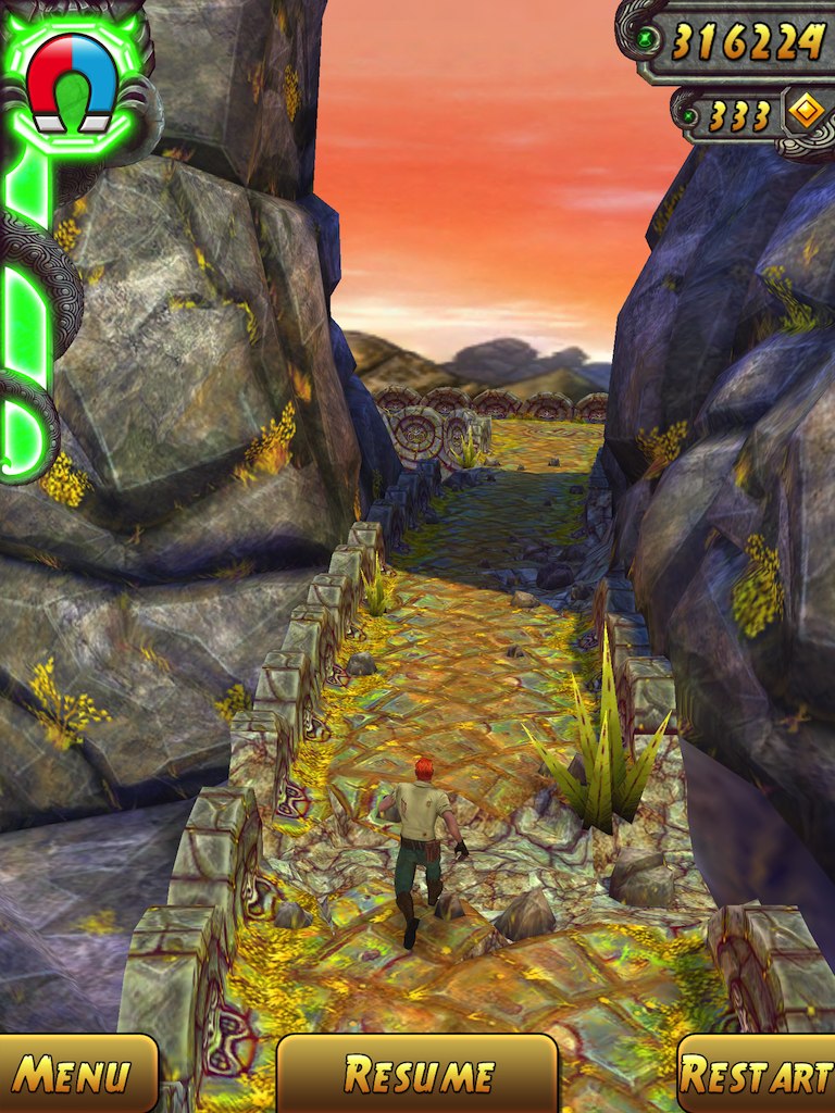
Have Imangi not heard of padding? The score (“333”) is off-centre in its box: there is a margin at the bottom but padding at the top is non-existent. Similarly, the “Restart” text awkwardly touches the left and right bounds of its button.
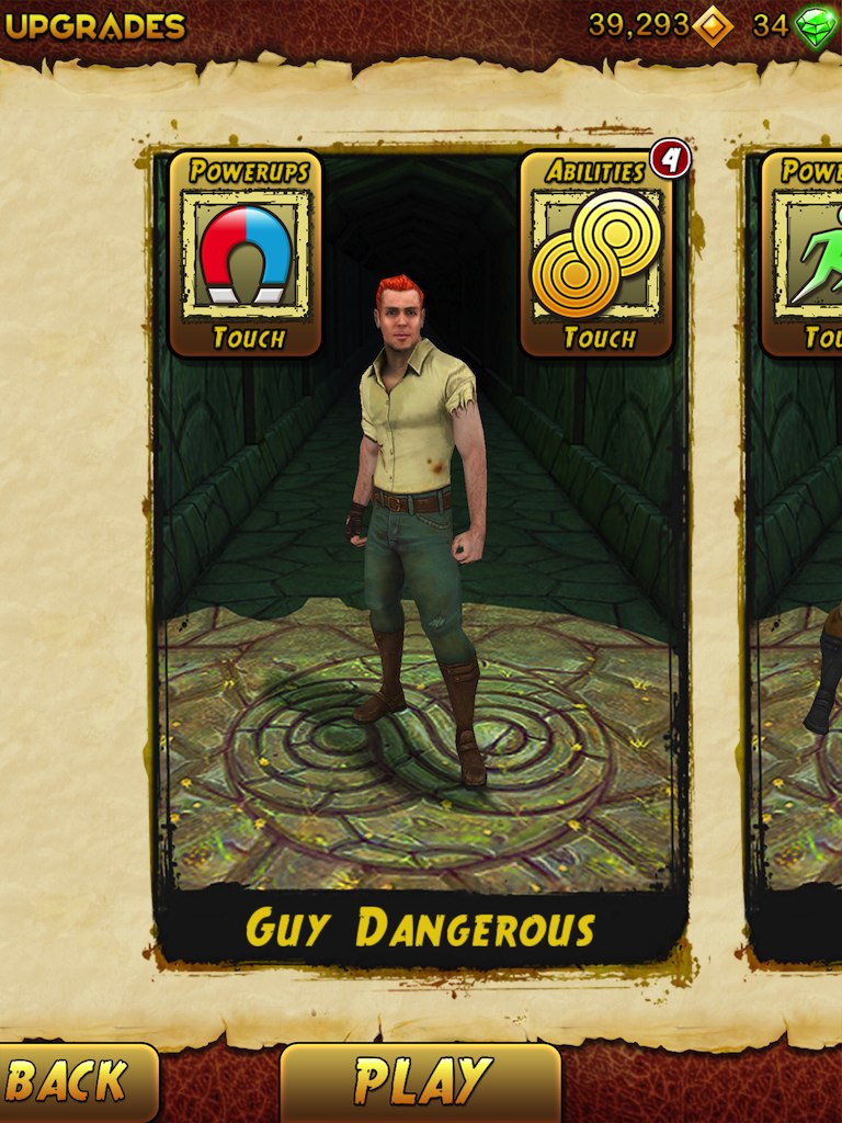
The same spacing issues can be found in the character selection screen. There is no space to inset the coin count from the coin icon. Notice, too, how the number in the red badge is hanging towards the bottom of the circle. The font isn’t kerned either; the slanting “A” leaves big gaps in text across the entire app.
Also, note the visual inconsistency of the lower-left button. When compared with the previous screenshot, the trailing spacing is wildly different. The “Menu” text is given a reasonable margin, but the “B” in “Back” is practically hugging the edge of the screen. At first, I thought it was the font screwing up the text metrics …
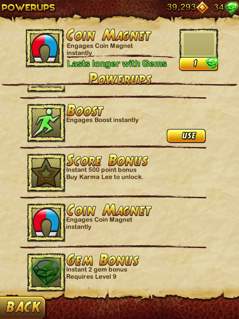
… nope! Look at this screen grab and observe that the left spacing is different again, even though the text matches exactly (“Back”). In a world where scripting libraries encourage code reusability to ensure consistency, Temple Run falls down.
Another big failing of this screen is the gem power-up gauge. Unlike the previous niggles, the ambiguities present in this UI will directly affect user’s enjoyment. Before interacting with the component, it looks like the upgrade lasts forever, because it looks like the other power-ups, which are all permanent. As you can probably fathom from my tone, the actual behaviour contradicts this implication. Every time the magnet is used, one gem of the gauge is consumed.
Losing a gem is not a big deal per se … but imagine how this escalates into a real concern. A normal user will not bother to test the app to determine the actual functionality; the majority of people will just assume the game depleted their gem bank erroneously[3]. As a result, the level of trust the user has with the game will undoubtedly erode. They may avoid this particular feature or, worse, suppress engagement with the game overall — fearing uncertainty.
I could continue describing miscellaneous problems with Temple Run’s UI, but I won’t. The point is made. Relative to the polish of the main game, the menu design is terrible and reeks of negligence. It would only have taken a few hours of QA resources to find and resolve these problems.
Whilst this does not prevent Temple Run 2 from being a great game, it does stop it from being perfect. For ultimate satisfaction, perfection should always be the goal.