Bingo Machine 3
Today, I am really proud to announce the new Bingo Machine for iOS 7. Well, not exactly. It’s been a long time coming. I began work on this version of the app in June 2013, after WWDC. I hated the new look I had designed, I wasn’t sure what I liked in the new world of flat design, so it took time for me to be happy with something. I also had other stuff to do, other stuff got in the way.
Time eventually rolled into mid 2014. At this point, I decided I might as well skip iOS 7 entirely and wait for iOS 8. Crucially, Apple introduced live blurring for third party apps in iOS 8 … which then meant I could rework the design of Bingo Machine some more. I settled around September, but again delayed shipping as I prioritised some client projects and getting a Writing Aid widget out the door.
Naturally, Apple released WatchKit in November so I messed about with that, putting off the finishing touches to Bingo Machine again. I ended up dropping the Watch app again though. There was also some holdups with getting assets together. However, it’s finally done.
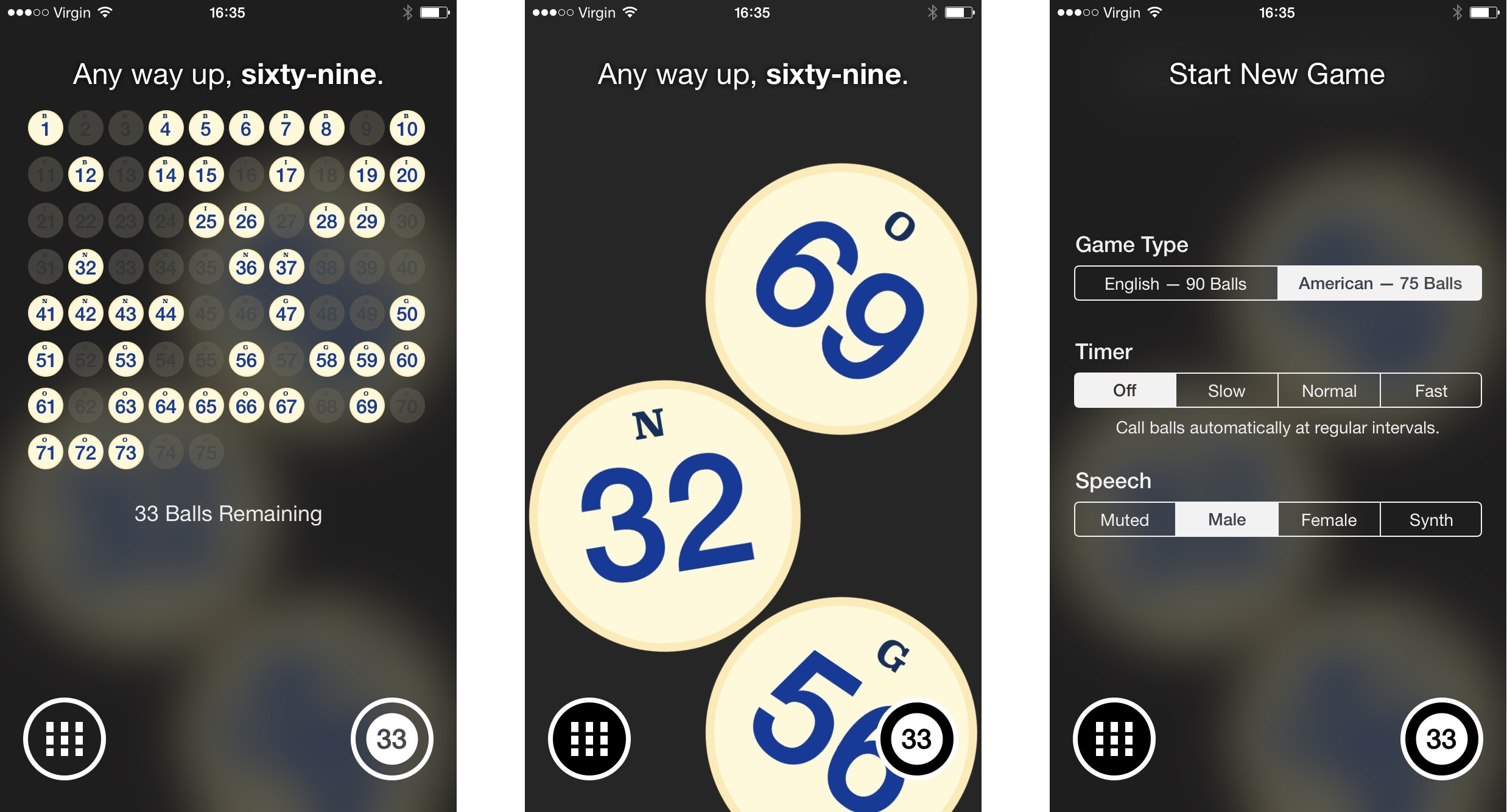
Bingo Machine 3 finally escapes the world of fake gloss and textured linen with a design that centres on black and white colours without feeling sterile. I have kept a level of realism to the bingo balls, although still drastically simplified over their previous designs. I use a physics engine (Box2D implementation, as UIKit Dynamics does not support circular bodies) as a substitute for the visual realism. It also feels more native to modern iOS. Balls fall freely into a full-width canister. I experimented with accelerometer-controlled movement but it was too distracting to keep.
The new appearance also drastically simplifies the mental model of the app. The application now has just three screens. The canister, the overview grid and the settings toggles. The latter two of these are presented as light modal panels, so users never lose context of the current game.
Thanks to live blur backdrops, activating the grid view to review called balls no longer feels like initiating a separate state. It feels like a transient display that can be quickly toggled on or off by tapping the bottom-left button. I love these toolbar buttons by the way: they have transparent inscriptions and inverted button states.
The bottom-right button represents the application settings. The icon is dynamically generated, though, so it can double up as a numerical status as well. Most of the time it shows number of balls left but will also act as a countdown when the calling timer is enabled.
I simplified the settings page itself down to a simple series of segmented controls. I love the symmetry. Most of the time the user will see three sections, customising game type, the timer and speech mode. If an external display is connected, a TV-Out option is dynamically appended below.
Whilst version 3 is mainly about a much-needed redesign, there are a few new features. I’ve re-recorded the spoken human catchphrases (and added a female speaker) as well as offering a synthesised voice which can service many more languages adequately. I am also experimenting with localisation of the UI into French and Spanish.
As Bingo Machine is often used as a learning tool, I have also added a way to change the language of the catchphrases independent of the iOS system language. It’s currently exposed with a long-press on the calling button and pretty hidden. I may have to change this in an update if I get a lot of support emails. I’m banking on it being a power-feature to justify not exposing it in the UI explicitly.
The canister design is better suited to the state of iOS devices, which now span many screen sizes and ratios. For taller devices, I can simply display more balls on screen. For iPad, I now use a split-view presentation with the canister view adjacent to the called balls board. I never liked how Bingo Machine was presented on iPad, it’s still not perfect, but it is miles better.
My goal with Bingo Machine 3 was to make something that was obvious, that required no explanation. I also wanted to portray a modern-but-consistent visual style across the application, straying from iOS’ visual appearance where I felt it was inadequate. I like to think I achieved these aims.
Bingo Machine 3 is still just $0.99 cents on the App Store. Tell me what you think and leave a review — it really helps.