Yahoo's New Logo
We’re excited to share the new Yahoo logo with you. It will begin appearing across Yahoo properties globally tonight.
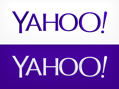
It would look alright if it didn’t have a bevel effect, which instantly dates it as a ‘last decade’ design. The white on purple appearance is better because the bevel shading is much more discreet. Even so, it’s still pretty dull typography. Yahoo’s ‘30 Days of change’ explored many different unorthodox designs, with interweaving glyphs and variable stroke widths, making the end result feel like a letdown. I had expected to more ambition in the final logo.