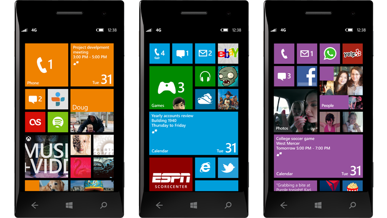
Windows Phone 8's Start Screen

The main Windows Phone 8 user interface change that Microsoft is showing right now is its improved Start Screen. “We’re going to have three sizes of live tiles, small, medium, and large,” says Sullivan, pointing out that the existing ones in Windows Phone 7 are medium and large versions. “The small tiles will enable us to fit more on the start screen, and to have things that don’t require a lot of real estate to convey information.” Inline with this change, Microsoft is also expanding the screen real-estate that you’re going to be able to place live tiles on. The trough along the right hand side of the Start Screen will now be filled with tiles. “It’s going to fill up the whole screen,” explains Sullivan.
In Windows Phone 7, there was a right-hand side margin of pure blank space. This caused the home-screen tiles to flow into a skinny column, which directed the eye to the content immediately. In Windows Phone 8, the tiles now fill the entire width of the screen. As a result, I think Microsoft has made the experience feel much more busy and cluttered than it should.
I’m not sure which part of the screen to focus on first. For the general consumer, I can easily see them being overwhelmed by the new look. There is simply too much onscreen at once, with no organisation of any kind.
It feels more like an aeroplane cockpit than a refined dashboard of applications.