The New GarageBand For iPad

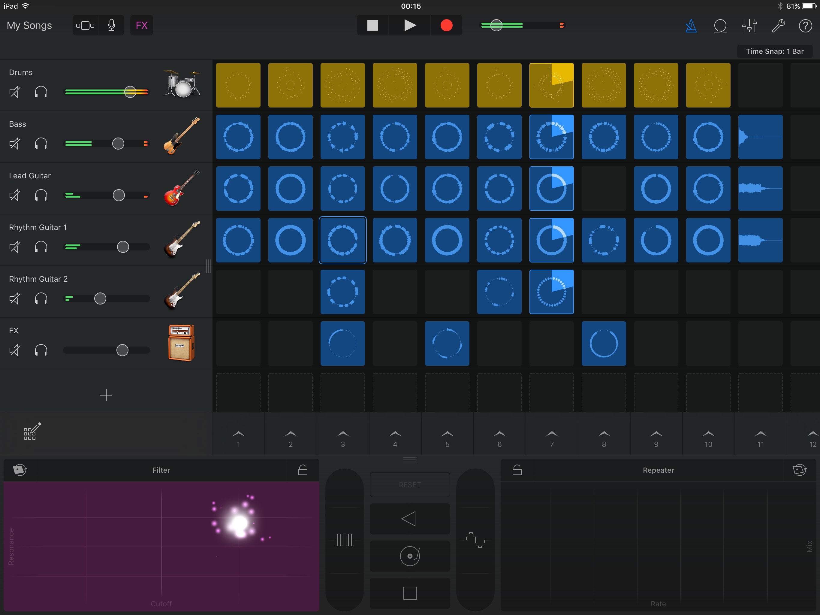
Just look at this app. It’s beautiful, capable and intelligent. Beautifully drawn skeuomorphic instruments subtly integrated into a dark, flat UI. The grid of loops takes music production into a direction other than a scrolling X-axis timeline. Not only that, the icons for each grid cell represent the music that is playing. The circle shows how the loop will play out over its duration, with a line representing silence and a thick notch indicating heavy sound, it’s like a cylindrical waveform. You can see what the loop is going to do and its synced to the progress indicator 1:1. They are not mere arbitrary symbols.
There’s even a live particle effect for the Filter and Repeater adjustments. This is one screen of a deep, deep app and the same high quality bar is maintained throughout. The GarageBand team truly knocked it out of the park. This is the standard by which other professional iPad apps should be judged. Whether anyone but Apple can justify the same level of investment into iPad is a different matter.