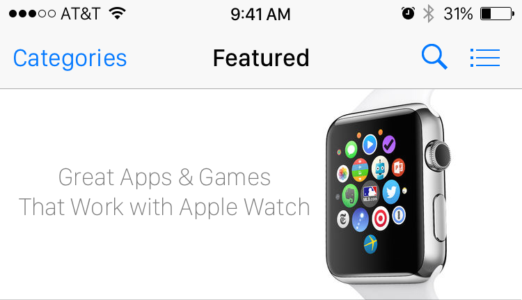
Mike Beasley Mocks Up iOS 9 App Store App With San Francisco Font

A second factor that helped influence these design changes (to a lesser degree) is the rumor that iOS 9 will change the system font to San Francisco, the typeface created for the Apple Watch. All of these mockups use that font.
On the Happy Hour podcast, I tried to make an analogy between swapping fonts in UI and introducing a new piece of modern furniture into a room. I say tried because I’m pretty sure I failed to make my point.
Let me try again in words. You can’t just replace all instances of Helvetica with San Francisco if you want the design to look good. The rest of the iOS UI is dependent on the Helvetica sizing and aesthetics. I think Beasley’s mockups show this well. On toolbars, the angular square letter forms of San Francisco just don’t mesh with the nicely rounded bar button icons like the Search magnifying glass. These icons are rounded (and use the same line width) as Helvetica, not San Francisco.
To do this properly, you would have to rework the bar button icons and other details (like navigation bar height).
Font choices are an integral part of the UI and the whole design is interconnected with the choice of font. For the Watch, Apple made different variants of San Francisco for different parts of the interface. It’s designed with the mannerisms and characteristics of font in mind so it works well and looks good.
For iOS 9 and OS X 10.11, I hope Apple will apply the same level of care although I fear they haven’t. Redesigning UI and drawing new icons is a big project and the rumours haven’t pointed to this happening. One semi-solution might be to use the rounded San Francisco typefaces. They will — naturally — be a better fit as a substitute for the (also rounded) Helvetica.
Unfortunately, the historical precedents suggest Apple will not apply this level of care. With Yosemite, Apple willingly switched out Lucida Grande for Helvetica on the Mac and I think the result is not ugly, but not beautiful. With just two days until the reveal, I can only hope that Apple has done a better job this time around.