this says i get an instant 1$ rebate. and it’s on the inside. that mean i get a dollar back instantly! now just how exactly did they do that?
they put a dollar inside. a literal actual dollar. imagine my reaction when i saw a dollar inside of this little package, cause it was literally the first thing i saw.
I don’t have any tangible connection to the game itself, I don’t think I’ve ever played a game of Cards Against Humanity to completion. The concept is good but I’m not confident enough to make the crude jokes which are the crux of the gameplay.
Even so, I think the Cards Against Humanity company is a fantastic entity. Everything they do feels like it was thought up by a group of people sipping drinks and coming up with stupid ideas that are nevertheless practically possible. As an added bonus, the company raises a lot of money for charities along the way.
I haven’t bothered to verify if the Tumblr story is true, that every CAH packet sold at Target advertises a $1 rebate and includes a real $1 bill inside. In general, I would be very skeptical about such an anecdote due to the questionable legality of reselling currency as retail goods. It’s a funny, dumb, minor joke that no normal company would bother navigating the statutory legalese (or suffer the 25% drop in unit margin) to actually execute. Yet, because it’s Cards Against Humanity, it’s believable.
Samsung Electronics Co. has temporarily halted production of its troubled Galaxy Note 7, according to a person familiar with the matter, the latest setback for the South Korean technology giant as it struggles to manage a recall of 2.5 million smartphones.
The move comes after a spate of fresh reports of overheating and fires with phones that have been distributed to replace the original devices, which also had a risk of catching fire.
It was embarrassing enough to have the flagship Note 7 catching fire in the first place, let alone that the replacement devices (which included firmware to display the battery indicator as a ‘safe’ green colour) also seem to have the same fault. I think Samsung has been lucky that none of these reported cases have resulted in serious injury.
I’m not sure how many more chances Samsung gets to fix the problem before regulators enforce a sales ban. Reports indicated that the company believed the problem with the original devices was the battery itself; the replacement devices used batteries from other suppliers. With those now spontaneously combusting as well, it seems more likely that the issue is inherent to the design of the phone, rather than an isolated defective component.
I’m assuming Samsung will take its time before releasing its replacements for the replacements, so the Note 7 will almost certainly miss the holiday sales window.
According to well-placed sources, they say the next iPad Pro (12.9-inch) gets the iSight camera 12 million pixels and True Tone flash and True Tone display correspondence to Display P3 will be adopted.
iPad mini 4 will renew as iPad Pro (7.9-inch), get Smart Connector, and change into the specification of 4 speakers audio. Also, the iSight camera of 12 million pixels, True Tone flash, and True Tone display correspondence to Display P3 seem to be adopted.
With the iPad mini previously pronounced by some as a dead line, it’s a pleasant surprise to hear about Apple’s 7.9 inch tablet form factor again. I’ve never sought a Mini myself but it serves a nice niche for people who just want an eBook reader, as well as a cheaper tablet for children. Or at least, that’s what the Mini used to serve.
This rumour by Macotakara is intriguing because it speaks of a ‘pro’ iPad mini with high-end features, effectively describing an iPad Pro with a 7.9 inch display. Naming and pricing is unknown but if it is called an iPad Pro 7.9 inch, I doubt it will be targeting the budget price points that the Mini currently does. It’s like how Apple offered 13 inch, 15 inch and 17 inch MacBook Pros at one time. Three flavours of the same basic product.
The alternative is that the new Mini is still positioned in the range as a cheaper option with the refresh bringing many of the Pro-tier features to the lower-end price points now that components are cheaper. My hesitation with this, though, is that a cheap iPad Air is also rumoured. It would be weird to have both hanging around, I think.
Not sure what to make of this whole thing just yet. I still like the outcome that KGI had implied before, where the Mini is removed from sale and a cheaper iPad Air is substituted in as the new lower price iPad.
At a price of $129.99 and with limited distribution, it won’t be relied upon for significant immediate revenue. Spiegel refers to it as a toy, to be worn for kicks at a barbecue or an outdoor concert—Spectacles video syncs wirelessly to a smartphone, making it easily shareable. “We’re going to take a slow approach to rolling them out,” says Spiegel. “It’s about us figuring out if it fits into people’s lives and seeing how they like it.”
Here’s the announcement video. I liked the premise of Google Glass as much as I like the premise of these Spectacles, in that you can interact with a computer that can see the world from the same perspective that you do.
Current technology, though, limits the realisation of this vision in a big way. Smart glasses are too conspicuous and too invasive. I remember something Tim Cook said this on topic in the run-up to Apple Watch; “I wear glasses because I have to”.
This stuff will all catch on once it can be made smaller and integrate into people. The technology needs to get miniaturised so that it can be invisible. Even contact lenses might be too much of a barrier to entry (fiddly to apply, dry out quickly). This is really futuristic stuff but until it is a reality, I think Spiegel is right to characterise the Spectacles as a mere toy.
It’s worth nothing that the company has rebranded and is now called Snap Inc, subsuming Snapchat, Spectacles and whatever else they are working on. They aren’t betting on wearable eyeglasses at all, it’s a stepping stone. They are firmly a camera company now, moving with technology as it evolves.
I run betas on my iOS devices but I stay on public releases for macOS (née OS X) as I only have one machine and stability is mission critical. As such, I installed macOS Sierra for the first time yesterday when it was released to the public.
It would be unfair to call Sierra buggy. I haven’t seen any apps crash or any system hangs. Reports from the beta seeds concur that 10.12 is solid. I do get the impression that Sierra is somehow unfinished, or rushed. There are only a handful of headline new features, but I’m hard pressed to call them complete.
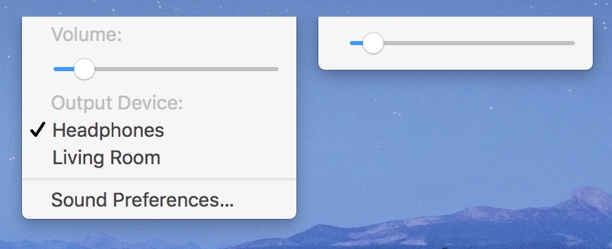
The volume slider in the menubar is now horizontal. The reason is because it is also shows output devices in the same list so it gives quick access to Bluetooth headphones or the living room Apple TV. This is fine and the change is well-motivated once Apple’s new AirPods wireless earbuds ship.
It’s not buggy, the volume will change when you drag it, but it isn’t ‘done’. Note how the selected audio output is indicated by a checkmark. When there’s no AirPlay outputs, the view adapts just to show the slider and nothing else. Disappointingly, the view doesn’t collapse the inset for the checkmark that is no longer visible, so the volume bar is off-centre. Not off by a couple of pixels, off by a lot: the left gap is almost twice as wide as the right gap. Someone said this was ready to ship and it’s clearly wrong. I noticed the misalignment within hours of installing the update.
Another example is Siri, marketed by Apple as the single biggest new feature of Sierra. Does it work? Yes. You can dictate queries and returns responses inline to the popover panel. It doesn’t feel finished, though. I found multiple things ‘wrong’ just with the Help screen (press the little question mark); the subtitle font is tiny and the (lack of) contrast makes the subtitles hard to read; the detail views will push without releasing to confirm the click; errant padding at the bottom of most of the suggestions and the back button is styled so discreetly you can’t see when it appears.
I’ve barely used macOS Siri and I already have a list of niggles and unfinished edges. I’m even ignoring things that are potentially debatable and just focusing on things that are unequivocally wrong. Even if you discount that stuff, there’s still the major gaps in functionality to consider like the lack of any third-party app integration into Siri on the Mac despite heralding a Siri SDK for iOS 10 as a flagship feature.
I can’t get Universal Clipboard to work, full stop. I copy a string of text on my Mac. I press Paste on my iPhone. Several seconds pass, and nothing happens. If I go the other way, the Copy command freezes my phone for multiple seconds and the laptop Ctrl+V freezes my Mac for multiple seconds. In both cases, no data ends up getting pasted at the destination. The seconds of waiting seems like it knows it wants to transfer some data but it is yet to succeed.
There is nowhere to check Universal Clipboard connectivity so I’m basically left in the dark about how to fix this because it fails silently. If it was done properly, it would flag up a ‘Universal Clipboard Failed’ alert with details of the error. As it is, I have no recourse apart from crossing my fingers and hoping it sorts itself out. I have verified that the devices are connected to each other over Bluetooth as I still get Handoff suggestions to continue application activities. Until it randomly starts working, copy and paste is simply broken on my devices. Even if it was doing what it is supposed to, I’d still have complaints about its design.
My biggest frustration is the Sierra’s Messages app. It supports so few of the new features in iOS 10. Most of my communications in Messages on the Mac are to people using iOS devices. Screen and bubble effects ungracefully fallback to a ‘(Sent with Lasers)’ message. If people send stickers to me, my conversation is gimped on macOS by gigantic images as the app can’t understand how to position them. Other iMessage apps just won’t work at all.
I expected iMessage apps not to work outside of iOS because they are iOS extension binaries. I expected stickers to be viewable, with the correct placement and scale. I expected all the new iOS 10 bubble effects to be sendable from the Mac and receivable on the Mac.
Messages on the Mac exists to continue conversations that take place on my iPhone. Now, Apple’s brand-new proprietary fancy adornments are completely unsupported by one of their operating systems. The fact they don’t is — honestly — deplorable. Cross-platform integration is a central benefit to Apple’s ecosystem and they are letting themselves down.
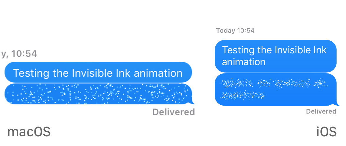
For reasons unexplained, there is one supported bubble effect implemented on macOS — Invisible Ink. One out of ten, right? No. The macOS version is so much worse. It looks like a snow globe from Windows 1998 with large pixels and a strange dispersion effect, like blocky particles are blowing in a gust of wind. It also naively covers the entire bubble like a dust sheet whereas the iOS implementation has the particles gently emanating over just the textual content. On iOS, you can almost see the shapes of the words behind the particles.
It’s difficult to convey the difference from static screenshots: look at Messages on Mac and iPhone side-by-side in real life and it’s easy to spot which is nicer. The Mac effect is embarrassingly mediocre and pales in comparison to the high-res fidelity of the iOS effect. The iPhone and iPad animation is so much more refined and so much more beautiful.
This might be the best argument yet for Apple merging the development environments of iOS and OS X. Right now, they have to make everything twice and they clearly didn’t have the development resources to do the macOS implementation justice.
My excitement about installing Sierra quickly changed to disappointment. This is an abridged list of such complaints where stuff consistently falls below my expectations for Apple software. I always have niggles to discuss but it is different with Sierra. This year, it is way more severe.
Maybe they were strained on engineering, maybe resources had to be reassigned, maybe Apple’s new reaffirmed focus on software quality has put more priority on not having things crash and consequently time spent on actual feature development and design QA is more limited. Regardless of the real reason, it gives the impression that Apple doesn’t care anymore about the platform. I hope that isn’t the case, I love the Mac, but that’s how it feels.
iTunes 12.5.1 surprised me; Apple actually changed a lot of stuff with sweeping changes to many views of the music library. Mirroring iOS 10, the new iTunes removes dynamic colour tinting and translucency effects, in favour of a plain white theme with occasional accents providing a splash of colour.
iOS 10 uses a pink tint colour but — for some reason — the new iTunes on Mac uses a blue shade. This discrepancy in colour palettes is jarring and I don’t see a reason for it to not match the Music app on iPhone and iPad. Aside from that, I really like the changes. The design is much cleaner and they’ve tidied up many loose ends. There is also a noticeable performance jump: the list of albums finally scrolls at a solid frame rate on my Retina MacBook Pro.
As another example of Apple’s iOS 10 design trends, the selected album is now delineated by a subtle shadow. The chosen artwork pops up from the library. Heavy San Francisco font faces are also used for the main titles and subtitles. They fit in well with the rest of the app and the font sizes are appropriate, unlike the equivalent iPhone fonts.
I was pleasantly surprised with the breadth of the UI changes in an update that, on the surface, has a pretty innocuous bump in the version number.
Apple seems to be switching up its preferred font weights. There is a renewed tendency by Apple design towards heavier weights overall. The iPhone 7 packaging uses a heavier weight for the box branding. iOS 10 uses heavy fonts too with the News, Home and Music apps. The keynote slides used a lot of bold San Francisco too. It’s not all San Francisco though, Myriad is still used on the new product pages.
I like the move back towards thicker fonts. The super-thin font trend brought about by iOS 7 is annoying. When everything is thin, the impact is lost. There are also readability issues (which even Apple has to specially workaround sometimes with using thin fonts for everything and limits the backgrounds the text can be superimposed on.
All text faces need to be used in moderation. Everything bold or everything light is not a good balance. Bold faces are good for titles and logos. Use them.
KGI’s Ming-Chi Kuo says that the iPhone 7 will be offered in two new case colors which are called “dark black” and “piano black”. Space Grey — as it is exists today — will be removed from the lineup meaning iPhone 7 and iPhone 7 Plus will be offered in a total of five colors. The piano black is described as glossy and corroborates leaked SIM trays seen previously. Due to low yield, piano black may only be offered exclusively on high-capacity iPhone 7 models, at least at first.
First off, KGI’s general accuracy does not seem to have extended to the names of these colours. “Dark black” makes no sense; there are no shades of black. I’m guessing what he means is dark grey, not wholly black but a substantially darker shade of grey than what Space Grey is today. Piano black is a descriptive name: it’s like the glossy finish of a grand piano. It’s worth noting that KGI does not know (or claim to know) the final marketing names.
I’ve been lusting for an obelisk black iPhone finish for several years. It’s finally happening and in a better way than I even wanted; two new black options are coming along at once. It will be interesting to compare the piano finish with the Apple Watch’s Space Black appearance; it’s the same idea but with different raw metals. I am also a bit concerned about propensity to smudge or scratch.
KGI says that the glossy black will be reserved for the more expensive iPhones, at least initially, due to yield issues. Regardless, it’s a win. Everyone will have access to a new dark grey colour anyway. Plus, KGI thinks the exclusivity window on the piano SKU is only temporary so people won’t be forced to shell out to get the cool colour … if they have some patience.
In Apple’s case, nearly all of our research and development takes place in California, so the vast majority of our profits are taxed in the United States. European companies doing business in the U.S. are taxed according to the same principle. But the Commission is now calling to retroactively change those rules.
Beyond the obvious targeting of Apple, the most profound and harmful effect of this ruling will be on investment and job creation in Europe. Using the Commission’s theory, every company in Ireland and across Europe is suddenly at risk of being subjected to taxes under laws that never existed.
Preface: I am not a lawyer.
Apple’s effective tax rate in Ireland was lower than 1% since 2004 according to the findings. On moral righteousness grounds, I think it’s fair to concede that Apple should have paid more tax in Ireland than they did. Even as an operations funnel, <1% regional tax seems ridiculously low.
However, both Apple and Ireland insist that nothing was illegal at the time. Apple made an agreement with Ireland back in the 1980’s and it paid off years later, when Apple grew into a huge corporation.
If the European Commission thought what Apple was doing was unlawful or incorrect, it had years to raise a formal complaint. What I really detest about the Commission’s judgement is how they are imposing their ‘new’ position to the past. The Commission is demanding repayments of ‘unpaid’ taxes from more than a decade ago. To me, that is unequivocally unfair.
Force Apple (and Ireland) to change its practices going forward, by all means. If Apple and Ireland were acting illegally (which both parties refute profusely), then levy fines. Reaching into the past to claim taxes that Ireland didn’t ask for at the time, and still says it isn’t owed today, is ridiculous.
All of these features and developments revolved around the core mission of Instapaper, which is allowing our users to discover, save, and experience interesting web content. In that respect, there is a lot of overlap between Pinterest and Instapaper. Joining Pinterest provides us with the additional resources and experience necessary to achieve that shared mission on a much larger scale.
Instapaper provides a compelling source for news-based content, and we’re excited to take those learnings to Pinterest’s discovery products. We’ll also be experimenting with using our parsing technology for certain Rich Pin types.
Most software company acquisitions in the tech world at the moment are head turning and puzzling but this isn’t one of them, as far as I’m concerned. Pinterest is a social bookmarking website with a focus on photography. A purchase of Instapaper allows them to easily grow into other content types, namely text.
Hidden at the bottom of this announcement is a ‘sunsetting’ of Instaparser, a paid API endpoint for developers to take advantage of Instapaper’s intelligent article parsing. The service is shutting down in November. It launched in April, now being shuttered in the same year it was debuted. This is pretty crappy especially given Instaparser was a paid service charging hundreds of dollars per month for an API key.
Personally, I didn’t see the motivation for Instaparser to exist. It sucks for those who adopted it but shutting it down is the right strategy for a company that is otherwise very focused on just doing one thing. It was a mistake to release Instaparser at all.
How do we know when a new golf course opens up? We’re not exactly driving around looking for golf courses. But we know it’s there, because there are all these golf apps that get used at a golf course. If we see that all these golf apps are being used at a particular location, and we don’t show that as a golf course, we probably have a problem. You can discover that pretty quickly. It’s not as if you need a year, or anything like that.
The inferences made by the crowdsourced data are then followed up on with ground truth teams (people that drive around verifying locations actually exist), web research or checking satellite data. It’s unfair to say that Apple is powering maps by crowdsourcing but it definitely plays a role in finding points of interest and road changes.
What I think is interesting is how much Federighi and Cue play up the benefits of data collection elements, I’ve never seen them emphasise it like this before. Usually, it’s very quaint with endless assurances about privacy and anonymity. In this interview, though, they admit that the data they do collate is enough to accurately pinpoint new sports venues. It may not be personally-identifiable but the fact Apple can trace the construction of golf parks from App Store downloads is pretty wild.
Cue’s enthusiasm also runs counter to Apple’s company message that they don’t want your data. I am in the camp that Apple could do better stuff if it did collect more data and it sounds like Cue and Federighi are almost begging for the opportunity to use it. I hope Apple relaxes its privacy stance somewhat and offers features that simply aren’t possible without accumulating a centralised store of user data on servers. Health data cloud syncing is the obvious example.
iOS 10 includes over 100 new emoji in total with new female gender options for athletes and professionals, new family characters and redesigns of the most popular emojis.
Apple is working with the Unicode Consortium to ensure representation of diversity across emojis. In iOS 10, Apple is adding new female emojis for runners, cyclists, swimming, builders and more. There is also a new rainbow flag (assumedly representing LGBTQ Pride), and the pistol emoji is now depicted as a toy water gun.
In the Unicode standard, this character is defined as a ‘pistol’. The Emojipedia definition describes the emoji as “a weapon that has potential to cause great harm”.
With previous iOS versions, Apple presented this emoji as an actual gunmetal pistol. With iOS 10, they’ve changed it to a green toy water gun. I don’t like how they have handled this. This has nothing to do with the associated political implications of free speech and everything to do with the way Apple has implemented this technically.
My personal qualm is that Apple has distorted the integrity of the Emoji language by replacing the glyph for a character which has a very different meaning. A toy water gun depicts very different intentions than a real gun. The 🔫 emoji now has an ambiguous meaning because it represents different objects across devices and operating systems.
On iOS 10 devices, the emoji in the previous paragraph looks like a water gun. On iOS 9 or on my OS X El Capitan Mac (on which I am typing this post) it looks like a serious weapon — a handgun. By the way, VoiceOver will describe that character as a ‘pistol’ on all devices, including iOS 10.
I tried to show a more sinister example on Twitter where the meaning of a message can now be misconstrued if the recipient and sender are not using the same OS.
Rather than recycle the same character code point, here’s what I think Apple should have done. Remove the pistol emoji from Apple’s keyboard completely. Lobby the Unicode consortium to add a new emoji that depicts a ‘water pistol toy’ and include that in the keyboard.
This handling is better because it does not affect usage of the handgun emoji on other clients, Apple would just be disabling the ability to write it on its systems. The water gun emoji would then be true to itself with a unique code, a consistent depiction of a toy water pistol across all platforms that support the latest Unicode standard and the correct labelling for VoiceOver accessibility.
Assuming Apple followed my suggestion, there’s still a question about how to display a message that includes a handgun emoji sent from someone else. Apple could let the symbol display, meaning iOS 10 would allow users to read, but not write, the gun emoji. Alternatively, it could treat the handgun as an unknown character and display the typical ‘character unknown’ black box placeholder glyph. I think either is fine, although the latter makes a more forceful statement on society.
Mr. Cue is also known for a hard-nosed negotiating style. One cable-industry executive sums up Mr. Cue’s strategy as saying: “We’re Apple.”
By 2009, Apple executives were considering a subscription streaming-TV service. To entice media companies, Apple offered higher fees than pay-TV providers for their broadcast channels. But Apple wanted only certain channels, so the effort fizzled.
I think an implicit line in this (extensively-detailed) piece is that Apple has messed up by not having a TV product out the door already. The Eddy Cue anecdotes are funny but there’s definitely a sense of blame, as if Cue’s lack of cooperation is a problem blocking a resolution.
I disagree. Aside from perhaps the Hawaiian shirt incident, it just sounds like Cue is portraying the needs and wants of Apple. Apple clearly doesn’t want to compromise on its vision for a TV service, so if it can’t get the terms it wants, it doesn’t pursue a deal. Cue isn’t causing frictions, he’s just representing Apple’s set-in-stone wishes. This isn’t a ‘Apple needs Steve Jobs’ problem either; the report documents a decade of failed negotiations with media companies, including when Jobs was alive.
In fact, it would be worrying if Cue was too complicit and arranged a halfway-house solution. Apple repeatedly says it will only do things it can do well and rejects things that are good, not great. Bowing to the wants of backwards-thinking media companies isn’t fulfilling that criterion.
Holy. I just discovered the force touch Clear All on the watch notifications screen. Just now. July 25, 2016.
The subtext to this tweet is a criticism of Force Touch in terms of discoverability. On this particular case, I don’t think this is a UI issue. In fact, it’s an ideal use of Force Touch in the Apple Watch interface; revealing an action that relates to the context of the current screen.
Concessions have to be made for a screen canvas that is the size of your wrist. If a button was present on the screen, I have no doubt that Drance would have found the Clear All function sooner. If we were talking about an iPad, where more screen space is available, I’d agree that some form of Clear All action should be more obviously present, probably as a text button at the bottom of the list.
The reality is an Apple Watch display is simply too small to put everything on screen at once. Some things have to be slightly obscured. Secondary actions cannot afford to take up persistent space in many cases: there simply isn’t the real estate. Some concessions have to be made and I believe that the right design decision was made here. If you use ‘Clear All’ frequently such that it feels like a primary action, you are using notifications wrong and should consider turning off alerts for some apps in the Apple Watch settings.
Clear All is less important than actually viewing the list of notifications, adding a button for Clear All would impair that (far more) frequent activity somewhat.
Heck, even on macOS most actions for the current app aren’t visible onscreen all of the time, but we still know they are ‘there’ because we have habitually learnt the vocabulary of the operating system. Things like using right-click, popover panels and menubar items become ingrained behaviours.
Apple is establishing a similar behaviour for Apple Watch; Force Touch to reveal contextual actions for the current screen. The actions should be relevant to the modal view as a whole, not connected to a particular element of where you pressed down.
Force Touch to Clear All is a coherent use of this system function. Becoming familiar with Apple Watch should involve an instinctual feeling to deep press screens when you want to perform a contextual action. This is consistent across Apple’s apps and should become learned behaviour over time.
Even when there aren’t any contextual actions for a view, Apple Watch UI will always respond with a screen bounce animation to suggest that the user was right to attempt the gesture and should try again on another screen.
Maybe watchOS is too new for it to become a natural instinct yet, maybe Apple should help educate users better about it. I don’t think the premise of placing Clear All action behind a Force Touch gesture is a bad design decision, though.
When true self-driving is approved by regulators, it will mean that you will be able to summon your Tesla from pretty much anywhere. Once it picks you up, you will be able to sleep, read or do anything else enroute to your destination.
You will also be able to add your car to the Tesla shared fleet just by tapping a button on the Tesla phone app and have it generate income for you while you’re at work or on vacation, significantly offsetting and at times potentially exceeding the monthly loan or lease cost. This dramatically lowers the true cost of ownership to the point where almost anyone could own a Tesla.
In cities where demand exceeds the supply of customer-owned cars, Tesla will operate its own fleet, ensuring you can always hail a ride from us no matter where you are.
This last item is the most interesting thing in Musk’s ‘master plan deux’. Cool idea, but it seems very pie in the sky. Reliable, foolproof, autonomous intelligence is still many years away … and that’s just half of this concept. The other issue is getting people to volunteer their cars to a self-driving fleet — surrendering their vehicle for unknown times to unknown people.
The good thing about taxi cabs and current ride-sharing models is the cars are manned by a human: someone is always there to monitor the actions of the travelling passengers. Leaving my car in the sole possession of someone else is an uncomfortable notion. The cars may drive themselves but they don’t clean themselves or repair themselves.
The last sentence is a much clearer path, where Tesla owns and maintains dedicated vehicles for taxi services. It still depends on the realisation of autonomy but the business model is clear. It’s Uber … without the overhead costs of paying drivers.
The following is a discussion of Swift 3’s controversial approval of the ‘sealed by default’ proposal that puts constraints on subclassability. To contextualise the decision, it is first necessary to review how Swift approaches access control.
In Swift, types and members are defaulted to internal visibility. This means they are only visible within the scope of the same module. In another module, internal types are not accessible at all. Making these things accessible requires a public keyword for every symbol. This means nothing is exposed to the wider project by default unless it is explicitly marked; only things that the developer have chosen to be available to other modules are.
This sounds onerous but it actually makes sense from a codebase design perspective. Generally, most methods and properties written into a class or struct are implementation details which are irrelevant to other consumers. As code is read more often than it is written, the benefits of distinguishing a public and private API surface outweigh the burden of having to write a public declaration every so often.
This ideology is central to Swift, favouring explicit statements over implicit behaviours. This is done primarily, but not entirely, to express the best coding practices. Developers have to make a conscious decision which parts of the interface are public and which aren’t. It enables for potential performance benefits like static dispatch and intelligent high-level features like Generated Headers.
All of this strictness is uncomfortable to Objective-C developers which is a lax language; it lets everything be ambiguously public or private at the mercy of the programmer. It was uncomfortable to me. Swift allows for the same dynamic runtime features, but it wants those capabilities to be explicitly defined and constrained only to the symbols that requires them.
The title of the post has nothing to do with any of this functionality, of course. There are parallels that you can draw though with clear similarities in how Swift is thought about and designed.
‘Sealed by default’ is a separate concept to runtime manipulation or access control in regard to its functionality; sealed classes cannot be subclassed outside of the module they are declared in. The underlying premise of only enabling functionality when it is appropriate is the same, using keywords to denote special entitlements.
Objective-C barely has the concept of modules, let alone being sealed. Any class in Objective-C can be inherited and overridden regardless of what framework it resides in. Swift 2 already has some limitations on this freedom. Although anything can be subclassed by default in Swift 2, there is a final keyword that prevents any source from subclassing it (essentially becoming a reference type struct).
final is more restrictive than sealed which is more restrictive than open (the implicit Objective-C behaviour). Sealed classes are still open inside their own module. This allows flexibility for the module maker (supporting the common class cluster pattern) whilst remaining closed to the rest of the codebase.
The concept of sealed classes does not exist in Swift 2 at all but is going to be the new default in Swift 3. Developers of modules can add the ability for classes to be subclassed by anyone using the open keyword on relevant type declarations.
This choice for classes to be sealed by default with Swift 3 has caused a lot of controversy; even the core team admitted there was no consensus in their mailing list post approving the change. I think it is the right thing to do but it’s not hard to see why others are angry.
The change removes the capability for application developers to subclass third-party library and framework code. The module defines what can and can’t be overridden. Sealed doesn’t affect a developer’s own classes, but it does stop developers from overriding framework classes, like those found in UIKit and AppKit.
Developers can use clever subclassing tricks to resolve some bugs that exist in third-party frameworks. These are almost always unsupported brittle changes, though, that aren’t guaranteed to be stable or keep working between OS versions.
To be frank, it is a fluke that this stuff even works. Subclassing where you aren’t supposed to is essentially injecting code into someone else’s private components. Ask any Apple engineer and they will tell you never to subclass UIKit. In Objective-C, this is only expressed via documentation and guidelines. With Swift 3, it can be enforced in the code and is compulsorily adhered to.
Perhaps there is a debate here about the usefulness of subclassing to combat bugs. I don’t think it is very useful though and will get even less useful as people write Swift frameworks in Swift where classes aren’t even that common and instead relying on structs or enumerations. A good example here is to look at the adoption of C libraries, here is any C library, which are made up of free functions. These functions can and do have bugs with no recourse via inheritance. This has not stunted adoption.
In general, language design should not be decided by the possible existence of buggy code. However much we strive to make perfect code, there will always be bugs. Sealed by default also prevents a different swathe of bugs from happening as API users don’t have to rely on humans to check documentation about whether something is supported. Sealed, final and open allow coders to accurately convey how their APIs are meant to be used, at least more accurately than Objective-C did.
As highlighted by the preface of this post, I hope the parallels between stricter rules about inheritance and stricter public-private access control are self-evident.
Designing and enforcing rules for inheritance is aligned with Swift as a language. It would be inconsistent not to have sealed by default with explicit keywords to allow for stricter or looser inheritance. It brings several benefits. Static dispatch can be employed more frequently when the compiler can guarantee there are no external subclasses. Performance benefits for a GUI application are minimal, granted, but every little helps.
Of course, the primary reason is creating a programming model that is more correct with proper encapsulation and containment. Classes that aren’t meant to be subclassed, can’t be. That has to be better than an ambiguous spaghetti mess.
I think if you can understand and agree with the explicit marking of things as public or not, then you should hold no objection to the sealed by default proposal. Explicitness in cases of ambiguity is a theme of Swift. Rather than guessing or choosing a lazy default that accepts anything, it is stringent in its enforcement. Accommodating debugging or monkey patching — when it flies in the face of the overall language — makes no sense to me.
The last thing I’ll say is that doing ‘sealed by default’ with Swift 3 makes the most sense when you consider the project’s roadmap. Apple wants Swift 3 to be the last major source-breaking release. Deciding to be restrictive now, with sealed by default, and then backtracking later is not a source-breaking change. Apple can freely make things open again … if the change really is destructive. It’s not possible to go back the other way, from open to sealed, in a source-compatible matter later on.
Even without any knowledge of the pros or cons of the argument, logic indicates to do the more bullish thing now as the option to reverse it remains available.