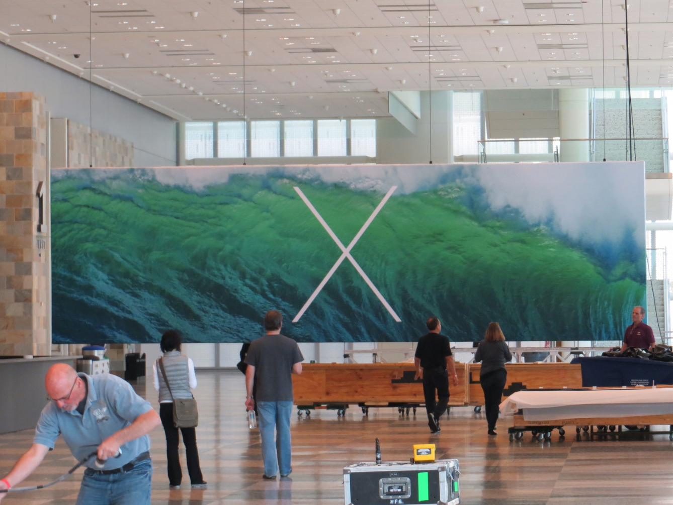
WWDC Banners For iOS 7 And OS X 10.9 Appear At Moscone West

The iOS 7 logo was snapped earlier today too, but that’s less interesting to me. The OS X banner is instantly striking.
With the iOS banner, the ‘7’ is given focus, with its multi-coloured fill, and the background is subtle. In contrast, the OS X banner gives prominence to the background rather than the letter. It is obvious that the letter is supposed to be the main message, but it isn’t forced. It is sort of paradoxical; the ‘X’ is in the center of the frame but feels tucked away. When looking at both side-by-side, I think the iOS banner is akin to an advertising poster whereas the OS X one much more closely resembles a moodboard.
The two banners are distinct enough to feel like they came from two different design teams. I don’t think you can infer anything about Apple’s product plans from it, but it’s interesting that strict uniformity isn’t on the agenda.