Marzipan
I don’t like marzipan. And I don’t like Marzipan.
I haven’t been running Mojave on my machine in the beta period. I always wait for public releases before updating the software on my (only) Mac. I knew what to expect of course. I don’t have my head in the sand. I watched the WWDC keynote, I saw all my friends’ complaints on Twitter, I was braced for it. But, man, these suck.
Marzipan apps are ugly ducklings. As soon as you use them, you can just know these are not at one with the system. You detect that there’s a translation layer of some kind at work here, just like when you use Slack on the Mac you instinctively feel that it’s a web app in a thin wrapper. The underlying implementation is exposed to the user with a bevy of performance sluggishness, UI quirks and non-standard behaviours. That’s bad.
I launch News. I see a window with a reasonable lineup of platform-standard toolbar controls, although I notice that the title of the window is ‘News’. This is a little odd as modern Mac design generally means that the application name is not repeated in the window itself. The title represents the active visible content inside the window, or they simply might not have a visible title at all. Not a universal rule, but certainly not the norm.

Then, only a few pixels down the screen, is the words Apple News repeated again, this time in all-caps. ‘News’ in the menubar, ‘News’ in the titlebar, ‘Apple News’ in the sidebar. Is the word News redundantly displayed in these three different places because that’s what makes sense for the Mac UI? I’d wager it is not a design choice. I think it’s pretty clear that Apple News is in the sidebar because the sidebar is a wholesale port of the iPad interface. iOS on the iPad doesn’t have a menubar or a titlebar, so it isn’t uncommon for apps to put their branding in the app itself. Why is News in the titlebar? In this case, I suspect the Marzipan system houses apps in a window with a titlebar, and it automatically populates the window with the display name of the bundle. Home is the only app of the new set that bucks this pattern, instead using a segmented control as the centred toolbar item.
This first point is arguably a nitpicky detail, but it’s emblematic of the problem I have with these apps. Their fabric is so clearly of another world. A more blatant visual transgression is the News search field. It doesn’t look like a Mac search field. It is bubblier than an Aqua field, the corner radius is off. Moreover, when you press the little ‘X’ button to empty the text, the field loses keyboard focus and hides itself offscreen. That was surprising to me, and anything surprising is unlikely to be following platform idioms that are ingrained into my head. If you type something and then hit ‘escape’, the text box clears, keyboard focus is resigned, but the sidebar search results aren’t reset. I’d pass that last one off as a bug. (Voice Memos and Stocks exhibit the same behaviours, by the way.)
A big landmark sigh of frustration is that all of these Marzipan apps are single window affairs. There’s no attempt to support opening a company stock detail or a news article in its own window. Voice Memos is a particularly bad offender here. When you start a new recording, it takes over the entire window with a modal view. The user loses context of where they were. This is a common pattern on iPhone and iPad but it really feels alien on the Mac.

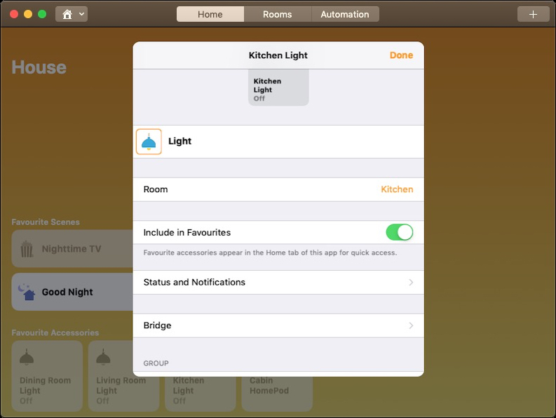
Home is the worst case of the single window constraints. It is an app that naturally has hierarchy. Single-window iOS uses modal form sheets. Marzipan Mac uses … single-window form sheets. You don’t need to be a designer or a developer to work out where these interfaces came from. It’s transparent. Interestingly, they did change the animation slightly on the Mac — form sheets appear with a quick fade rather than a slide up effect as seen on iPhone and iPad. If this was a real Mac app, it would spawn multiple floating windows, use source lists instead of touch-friendly bubbly tiles, popup menus rather than sliding reels, checkboxes not green switches, etcetera etcetera. I especially like how single clicking on an accessory tile does nothing but make it bounce a little.
Keyboard shortcuts are very patchy. My instinct when making a voice recording was to slam the space bar to pause. It doesn’t work. I went to the menubar and saw that it was greyed out in the current view, but noted that space bar does work during playback. The trip to the menubar showed me an item for ‘Play/Pause Recording’. If you look in iTunes, you will find a ‘Play’ command when a song isn’t playing and a ‘Pause’ command when it is. This dynamic nicety didn’t make it to Voice Memos, ostensibly because iOS doesn’t have a menubar so nobody considered those kind of situations before. For the same reason, the Touch Bar app region is completely blank on all of these ‘new’ apps.
Coming down to some more fundamental issues, I found button interactions to be wonky in places. Consider the ‘Details’ button in Home app for viewing active accessory status. How do buttons work on a computer? You press down with the mouse, and let go. If you press down and decide you don’t want to depress, you move your mouse away. Not so with the ‘Details’ button in the Home app. As soon as you have pressed down, you are committed. It doesn’t matter where your mouse goes. It can leave the bounds of the button, even the frame of the window, and its action will still fire. This issue does not plague most of the buttons in the Marzipan suite, but it was not an isolated occurrence either.
The Home app lets you use a jump bar to navigate to a room quickly through the toolbar item; this is a nice Mac feature. In fact, the equivalent navigation in the iPhone and iPad Home apps is much uglier as it involves an abuse of action sheets. However, you can also navigate between rooms by swiping left or right with the trackpad. This is a downright mess on the Mac. The swipes don’t register consistently, the momentum feels wrong, and sometimes you can make the view bounce as if it has reached the end of the pages, only to swipe again and have it suddenly spawn the next page. There’s also a really ugly rendering glitch with the background. This should not have passed QA.
I already mentioned how everything is single window. Let’s consider the basic window operations. You get the standard traffic light close/minimise/full-screen widgets and they work fine. Window resizing using mouse drags — not so much. The performance is just poor. I use News in this example video, and compare it with resizing equivalent content in Safari, and the difference is night and day. I observe laggy resizing on Home, Voice Memos, Stocks and News, and this is using a 2016 15-inch MacBook Pro. Again, I think this is an inherent part of how these apps are conceived — iOS apps don’t need to worry about live window resizing — bubbling up as user-facing deficiencies.
Here’s one another one I’ll toss out there. Try dragging a News article from the Today screen into a Messages conversation. You can’t do it, you get a funky file permissions error instead. Great. Now try dragging from the Today screen to the desktop. This will work, it will make a webloc shortcut file. However, it takes an extraordinarily long time. You can count many seconds go by before it completes. Whilst this happens, the rest of the app is locked up and cannot be interacted with. I even saw my mouse cursor turn into a beachball when doing this. Copying a link to the desktop.
I debated calling this post ‘Home, News, Stocks and Voice Memos for Mac’ because it’s not really a comment on the Marzipan project initiative. After all, I don’t expect the solution Apple ships next year to have the same laundry list of drawbacks that these Mojave apps do. It’s a critique of the apps that are shipping now to customers of macOS. These apps are preinstalled with the OS. News was even unceremoniously placed into the middle of my Dock upon upgrading. And they are not good, simple as that. I would have been mildly happier if Apple had offered these apps as optional App Store downloads affixed with a beta label.
Functionally, they are a win. These apps make the Mac do things it couldn’t before. That shouldn’t excuse them from blame, though. These are mediocre, bordering on bad, experiences. It’s not a good poster child for the future of the Mac. The Mac — heck Apple as a whole — is about delighting users with good-to-great experiences. What drew me to Apple was never how many bullet points they checked off the feature list.