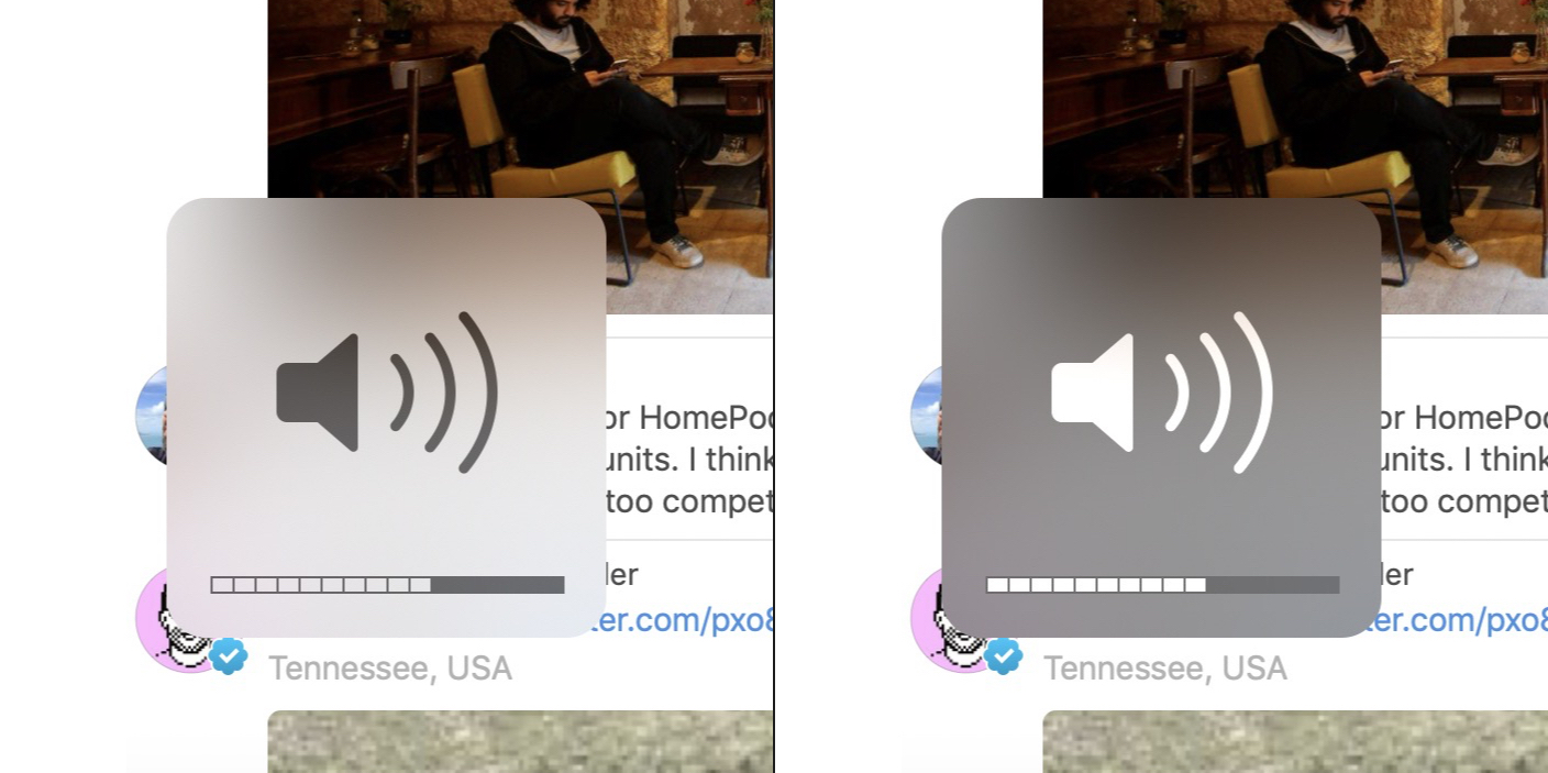
macOS Mojave Dark Mode

It’s funny. I don’t like Dark Mode enough to change to it full time but there are definitely parts of the appearance which are better than the Light appearance. I love how certain apps and panels look with dark styling, but I don’t prefer enough components to switch over wholesale.
The harsh white borders that spring up on window frames and other bars is particularly obnoxious. I get why they did it but it feels overdone for my tastes. I almost want to pick and choose a combination of light and dark components.
The header image is an example of something which is much improved in Dark Mode. The style of the volume HUD has irked me ever since the Yosemite bleaching. The grey blurry panel is just unattractive, reminiscent of blotchy mud. However, in Dark Mode, the blurred backdrop is much better with its darkened palette. The white glyph pops over the background, and the black surround doesn’t steal focus. The contrast of the elements is simply superior.