iPhone X Home Indicator Tinting
In a post for 9to5Mac, I brought up an area where the iPhone X currently does the wrong thing, at least in my opinion regarding the aesthetics of the home indicator. In an app with mostly dark content, like iTunes Store or the Watch app, the home indicator is coloured stark white.
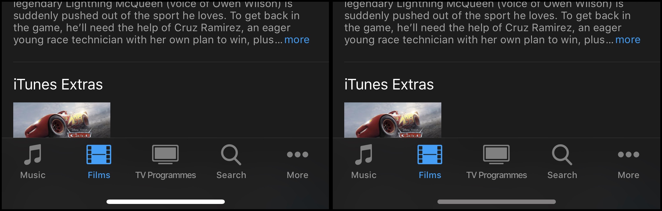
This is not very nice to look at, the subtle greys and blacks of the application clash with the bright white rounded rectangle. It distracts the eye. You can see that in the screenshot above, on the left. If you are reading this post on an LCD screen, consider that the problem is amplified further on an actual iPhone X with its high-contrast OLED screen.
In the right-side mockup, I color-matched the home indicator with the text colour of the tab-bar items. This is a simple but very effective change. From a technical perspective, UIKit could easily grab that value from the appearance proxy — no additional API surface needed — for a much more pleasing result. The home indicator is unmistakably still there, it just integrates neatly with the app chrome.
Ideally, Apple would expose a dedicated API that lets each app decide what colour the home indicator should be in the current context. It already allows developers to set whether the home indicator should be temporarily hidden, to avoid disrupting full-screen experiences like watching video.
The automatic algorithm does a decent job at guessing the best colour for the indicator at any particular moment (it’s actually a luminosity-blended texture, not one single colour), but it would be better if each app could provide its own suggestion. The suggested colour would only be a preferred tint; the system could choose to override the developers’ wishes if it deemed it necessary.
Right now, the indicator is only ever depicted in shades of grey. That doesn’t need to change with the API extension proposed above; in fact it’s probably enough if the API simply let the app say what the maximum brightness of the indicator should be.