Receding UI Design
Something that I really appreciate about the iOS 26 redesign is an emphasis on moving more toolbars and primary controls to the bottom of the screen, bringing them closer to the user’s thumb. Especially for Max-sized phones, starting a search for an old conversation in Messages used to require finger gymnastics to tap on the bar that was placed just below the navigation header. Now, that search bar is positioned at the bottom of the screen, and thereby easily reachable with one-hand no matter what form factor phone you are using.
At the same time, Apple’s new design guidelines also heavily evangelise making these bottom bars recede when not in use, such as minimising when the user scrolls down the page. I don’t appreciate this behaviour so much.
Modern iPhone screens are big, and specifically very tall. They are approximately 18:9 in aspect ratio, much bigger in height than width. Scrolling up and down is very natural for users to do, and the visible vertical viewport is already ginormous. Therefore, making bars minimise into a single row as you scroll has no functional benefit in terms of utilising precious screen real estate. There is always plenty of vertical space to spare.
In fact, the act of squishing controls into a single row actually exacerbates the relative lack of screen real estate in the horizontal axis. With iPhone dimensions as they are, horizontal space is constrained, and you have to be very selective about what can fit in the bounds of the screen’s width. Inevitably, this means important items must be hidden away.
You feel this in Safari, in the default “Compact” layout mode, where Apple crams the URL bar bookended by two buttons in a single row. Despite the address bar only displaying the domain, not the full path of the URL, truncation happens everywhere. On my personal iPhone 14 Pro, Safari can perhaps show fifteen characters of the URL, before it is forced to cut off and truncate. Most website domains are longer than that. Alongside the address bar, you can fit a visible back button, but all other common actions have to be collapsed into a sub-menu, revealed when tapping the ‘more’ button.
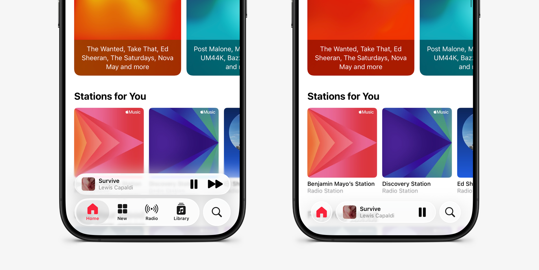
Personally, I find the minimisation trend most egregious in the Music app. As standard, Music shows two rows of controls, a persistent Now Playing widget and a tab bar for navigation to different screens of the app. But when you scroll downwards, the tab bar shrinks to a single button and the Now Playing platter switches to an inline presentation, featuring less space for the album title and one less button; the ‘Next Track’ action is inaccessible unless you tap on the platter to enter the full-screen player experience, or scroll up again to restore the two row layout.
As well as frustrating the functionality, it also just doesn’t look very good. Apple has to run several animations to make this happen smoothly and quickly, as the user scrolls. The tab bar buttons have to fade away and scale to a smaller size, and the Now Playing platter has to move downwards and reduce in width, while also handling the disappearance of the Next Track button. Even the persistent search button has to adjust its spacing to align properly with the other elements. There is too much stuff happening all at once, and it distracts the eye. When you scroll upwards, this all has to happen again, in reverse.
Rather than focusing on the content, my brain has to actively avoid the twitch reaction of wanting to look at what just moved in my peripheral vision. It’s a lot of mental overhead for no gain. Instead, keep both rows of controls permanently visible, and everything would feel a lot more visually cohesive — and you’d be able to skip to the next song whenever you wanted in one tap.