Home Screen Quick Actions In iOS 13 Beta 4

The worst parts of the 3D Touch user interface was the home screen quick actions system. The quick actions are useful, but the gesture of applying force to an app icon clashed with the gesture of long-pressing on the icon to make the icons jiggle and enable editing of the home screen arrangement. They are technically wholly independent interactions; one based on time, one based on pressure exerted. In reality, people found it nigh-impossible to differentiate those actions. It’s hard to long-press on a screen without also pressing firmly.
This overlap resulted in a laundry list of issues in iOS where the same UI elements would respond differently to pressure and long-press gestures. The home screen was by far the worst offender, though. Jiggle mode has existed since the dawn of time. All of a sudden, starting with the iPhone 6S, ‘long-pressing’ would sometimes work correctly and sometimes trigger this strange menu of actions — with no escape hatch.
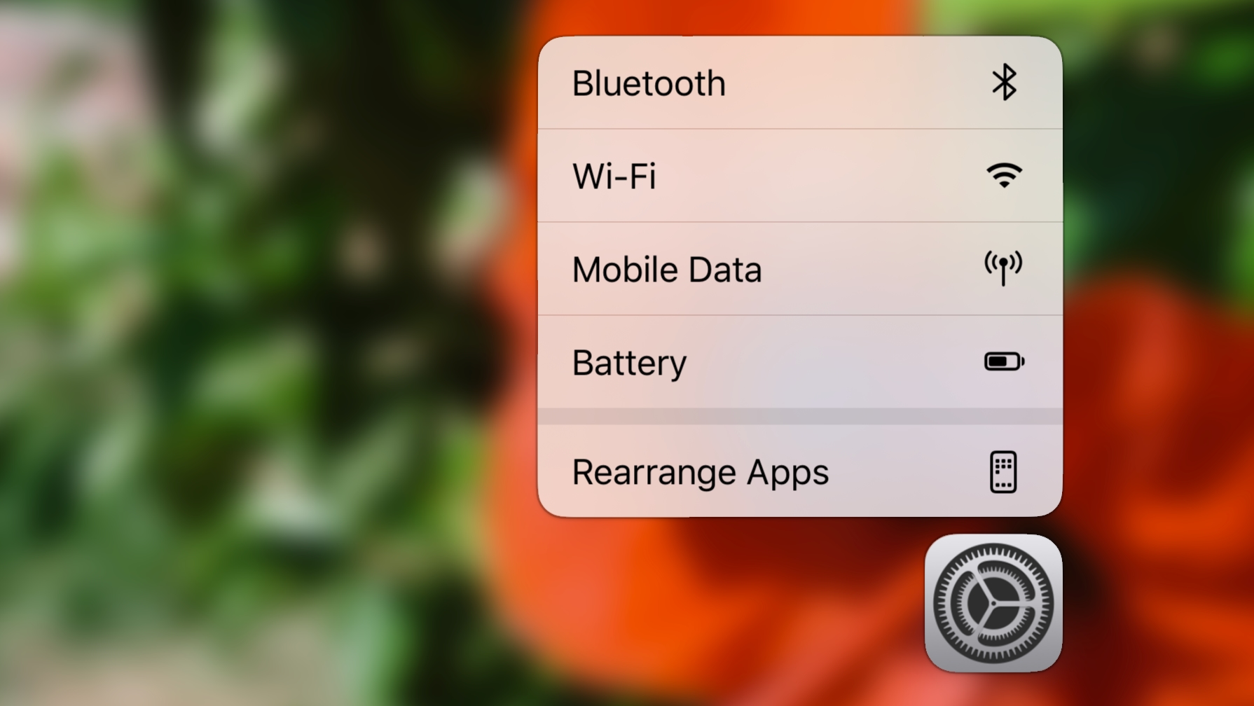
The new design in iOS 13 beta 4 is definitely an improvement over what came before. 3D Touch, Haptic Touch and long-press gestures are now standardised into this one context menu system. If you press down on an icon and wait, the quick actions menu always displays first. If you keep waiting with your finger still on the display, the menu dismisses and jiggle mode activates. If you apply force when you press down on the screen, i.e. using your pressure-sensitive iPhone display, then the same sequence of events happen. The benefit you get from 3D Touch now is that it reduces the delay before the quick actions menu is shown, thanks to the more affirmative initiation.
Moreover, if a user does release their finger early, the new system is still forgiving to the ‘average user’ who probably just wants to edit their home screen. This is because the quick actions menu now includes a “Rearrange Apps” item. Tapping this button enters jiggle mode. You can’t really get stuck in the wrong place anymore.
There are a couple of warts as of beta 4. It would be better if all of the new iOS 13 context menus featured taller rows. They are barely 44 pixels tall; this means small font text, tiny icons and not too much leeway in where your finger can be when you are quickly sliding around. In the old 3D Touch menu design, the buttons were like three times the size and the ergonomics were better for it.
The “Rearrange Apps” button is a great addition (and something I’ve been advocating for a while) but it is a bit lazy to just append it to the bottom of the other actions. It should be distinct from the app actions, probably as a pill button in the corner of the screen, like the Done button that appears when jiggle mode is active.
They also have this seamless transition from sliding to select an action in the menu to dragging the app icon if you keep going. This is a clever shortcut but it’s frankly a bit finicky right now. I find that the safe zone of the pan gesture is too small; it’s far too easy to start moving the app icon when you don’t mean to. And when that happens, the result is a messed up home screen. Not the nicest thing to have to deal with.
Hopefully, these niggles will get patched up by the time iOS 13 is finished. Overall, it’s a much better experience. And it’s an experience that is consistent across device type. It doesn’t matter what kind of screen technology your device has, all iPhones and iPads have access to the same features, and they all behave (mostly) the same.