Confirm With Side Button
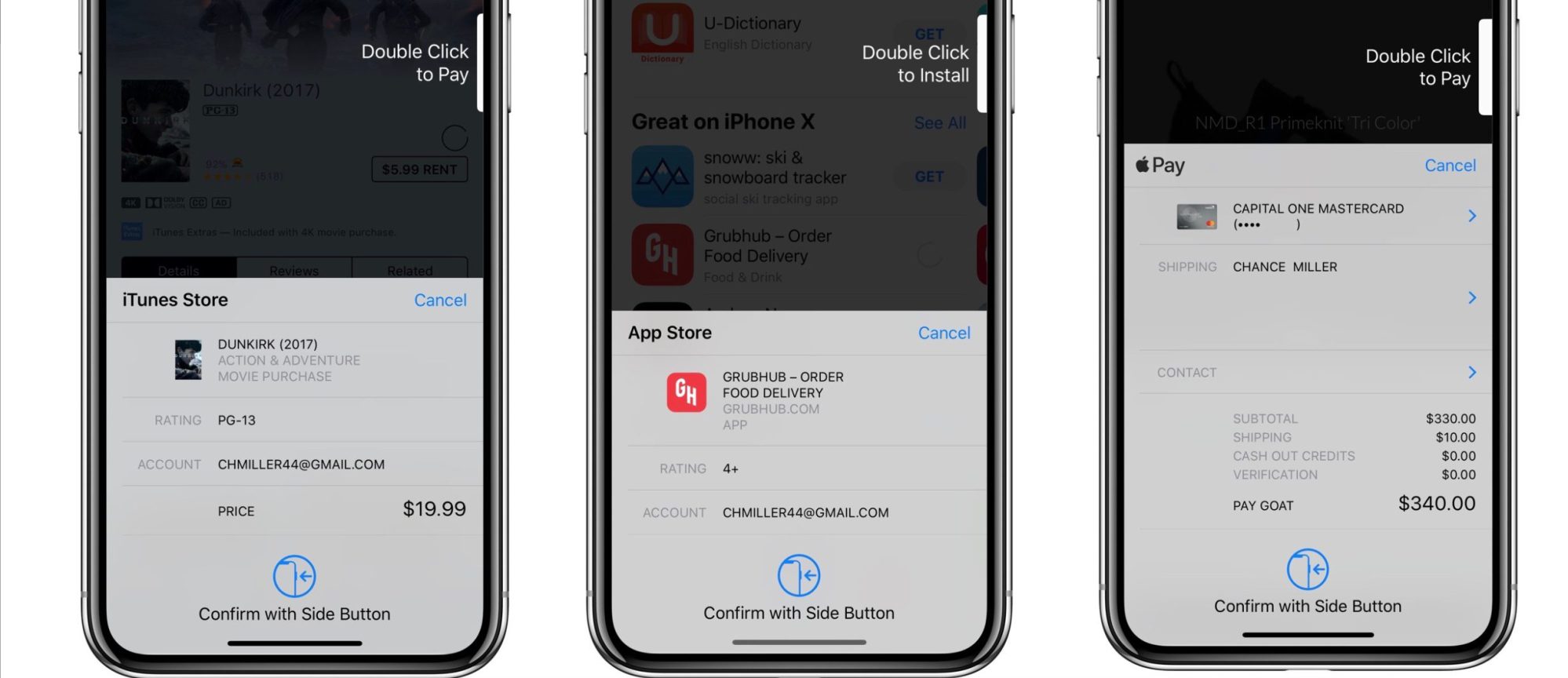
Originally, the purchase prompt window in iOS 11 would say “Double Click to Pay” in the upper-right corner next to the side button. Once you did that, the Face ID authentication prompt would appear. While this process was seamless in terms of design, it drew criticism from many users who said it wasn’t very intuitive.
With iOS 11.3, however, Apple has added a new prompt that appears before the Face ID process begins. At the bottom of the purchase window, you’ll now see a “Confirm with Side Button” instruction with an accompanying graphic.
Apple is extremely consistent with how it describes user interactions. A tap means to touch the screen. Firmly press means a 3D Touch gesture. A click is a depression of a physical button. This language is applied universally across Apple marketing and support documentation.
Nevertheless, this terminology is used so much interchangeably in common speech that the strict Apple definitions are easily forgotten. You need more than a change of wording to cause a pattern interrupt that forces the brain to break out of its primed touchscreen behaviour and think about doing something other than taps and swipes.
I saw plenty of people on Twitter confused by the ‘Double Click to Pay’ screen when iPhone X was new. The UI failed to express intent, despite the animated white indicator which slides in and out to imitate pressing in the side button at the exact point of the screen where the physical button is located.
This interface was actually first used on Apple Watch. When you go into the Wallet app directly, and select a bank card, the same text appears with the same animation sized to match the watch’s side button. Given the response to the very-similar iPhone experience, it probably confuses just as many people on watchOS too in percentage terms; the difference being that the number of times this UI is seen is far less as it’s more buried in a less-used operating system.
The change introduced in iOS 11.3 hopefully adds clarity to the interaction. It adds an icon of an iPhone X with an arrow pointing to the side button, alongside text that reads ‘Confirm with Side Button’. That should be enough to nudge people into doing the right thing.