Graham Spencer Shows How Quickly Apple TV Is Expanding

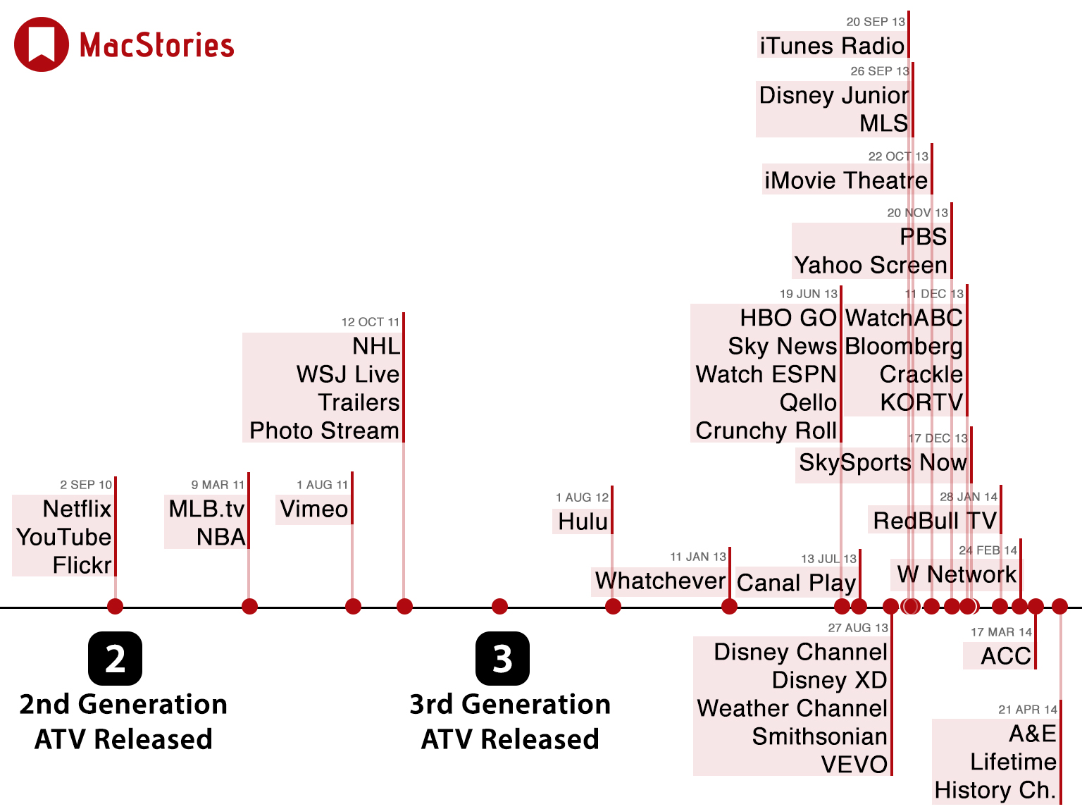
In fact, since the Apple TV (second generation) was released in 2010, Apple has added new ‘channels’ to the Apple TV on 18 seperate occasions. Excluding Apple’s own channels, the Apple TV now has 33 third party channels in the US, with a handful of other channels only available in countries outside the US. Even more interesting is the fact that in the last 12 months Apple has rapidly increased their pace of adding new channels, with 26 being added in that time period.
I see a lot of writers shove charts and flashy tables into their pieces when it really isn’t necessary. Most of the time, these additions offer nothing of value and just distract from the actual article.
When used properly, though, charts are a fantastic way of getting a point across. This is an example of a great visualisation. You don’t have to decipher it, the interpretation is fast and powerful. A mere glance at Spencer’s chart instantly portrays a meaningful message, in a way that a body of text simply couldn’t.