App Icons Should Be Iconic
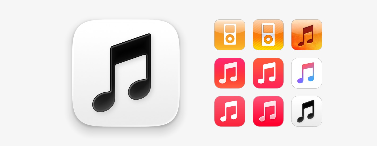
For me, a good app icon is — at its essence — memorable. An unstyled music note glyph is not memorable, and that’s exactly what Apple shipped for the new Music app icon. It’s really disappointing because I thought Apple had gotten to a good place with the state of their default app icon set; even Safari got a good icon with iOS 27.0. Then, Music in iOS 27.2 had to come along and ruin it.
What is downright bizarre is that Apple introduced a rather flamboyant backstory when they launched this new brand identity for Apple Music. The campaign is “made by sound”, to use Apple’s own words. They literally put an acrylic rounded rectangle in a bath of oil, and used sound waves to perturb the oil and capture the effect of the reverberating waves. The audio mnemonic heard in the commercials is cleverly reused to help make the visuals, too. Indeed, in the ads, you see this wave effect shimmer over the Apple Music wordmark.
Yet, somehow, when it came to translating this concept into the actual image millions of people click on every day to launch the app, all of this character and flair was thrown out. There is nothing to it. It’s a black note symbol on a stock white background. It’s a black note symbol on a stock white background. The outgoing Music icon was simple, too, but the pinkish-red gradient background at least gave it something unique to hang off.
In the iPhone’s first years, Music (then called iPod) had an orange or yellowish icon. iOS 7 landed on a pink-orange gradient. iOS 8.4 turned it white with a rainbow note, and since iOS 14, Music has had that bold pinkish-red background. The red made it distinctive, easy to pick out at a glance from the crowd of other apps on your home screen, and the colour scheme carried through into the app itself, with a matching red accent in the tab bar. I can’t argue that there is anything intrinsically musical about the colour red, but at this point Apple has set many years of precedent that Music is red.
The new version breaks from history with absolutely no upside. The icon has just been sapped of all colour and the app controls are tinted with the stock system blue accent. It manages to be both mundane and incongruous.
Bafflingly, Apple Music already has a much better icon ready to go. On social platforms like YouTube and X, they use this image as their profile avatar. It shows a snapshot of the acrylic captured mid-vibration, so you can see the note slightly distorted by some chromatic fringing. Artistically, I have some complaints about exactly how this looks, but I would choose it over an anonymous, monochrome glyph in an instant. It embodies the “made by sound” branding, and is certainly iconic.