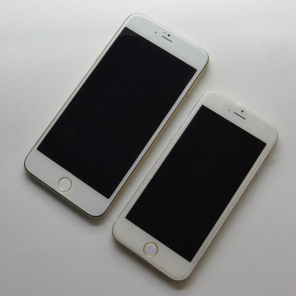
Realistic Mockups Of The 5.5 Inch iPhone Leak

Hello! #iPhone6
Although the 5.5 inch will seem like a giant next to an iPhone 5s, the image compares the 4.7 inch ‘iPhone 6’ to the 5.5 inch model … and it looks normal. It does not look oversized. iPhones are partly pieces of fashion, so perception of the size increase is critical.
My complaints with the 5.5 inch phone, assuming it mirrors this dummy unit of course, is the vertical misalignment of the Home Button and the camera/speaker holes. On the 5s, these components are precisely spaced in their bezel. Not on these mockups, unfortunately.
It’s not merely an aesthetic complaint — on the 5s, you can use the spacing between the screen and the bottom edge of the phone to firmly press the Home Button. I am worried that my finger would ‘slip off’ the device, with the button so close to the edge.
As an aside, the antenna inlets on the 5.5 inch look nicer than the 4.7 inch phone. The ratio of inlet height to chassis height is significantly lower, thereby making them much less obnoxious.